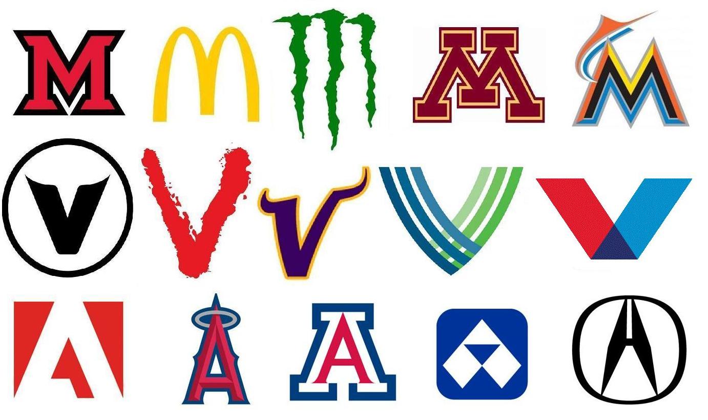
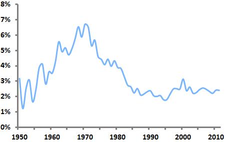
The single-letter monogram is a basic and classic form of logo that still enjoys wide use today. Looking back through United States Patent and Trademark Office data, we can see that the use of such monograms peaked in the US in 1970, when they made up 6.7 percent of new logos. By 2011, just 2.4 percent of new logos were single-letter monograms.
Single-letter monograms as a percentage of all new US logos
Further analysis reveals which letters are most popular for use in single-letter monogram logos. By comparing the prevalence of particular letters in monograms relative to their use as the initial letters in all trademarked words and phrases, we can see which letters are disproportionately used as monogram logos. For instance, “M” is the first letter in 6.3 percent of all trademarked words, but is used in 9.4 percent of single-letter monogram logos. This gap of 3.1 percent is the highest for any letter, indicating that “M” is most favored for use in monograms. The table below shows these figures for all letters.
Percentage difference between use of letters in monograms and use of letters to begin all trademarked words and phrases
M 3.1%
V 2.0%
A 1.7%
X 1.4%
K 1.4%
W 1.4%
Z 1.2%
H 1.1%
Q 1.0%
E 1.0%
G 0.8%
R 0.5%
Y 0.2%
N 0.2%
U 0.1%
J -0.3%
I -0.5%
D -0.8%
O -0.8%
B -0.9%
S -1.2%
F -1.3%
L -1.8%
P -2.2%
C -2.6%
T -4.5%
Interestingly, the four most popular letters for monograms (M, V, A, and X) are vertically symmetrical, while six of the seven least-popular letters are vertically asymmetrical.
Which letters are currently “trendy” for use in single-letter monograms? We can answer this question by analyzing data from the past five years related to new trademarks and “dying” trademarks. The table below shows the ratio of the share of each letter’s use in new monograms over the last five years to the share of each letter’s use in dying monograms over that period. So if a letter appears in 10 percent of new monograms and 10 percent of dying monograms, its ratio is 1, meaning that it is not at all trendy in a positive or negative way. However, if a letter appeared in 40 percent of new monograms and just 20 percent of dying monograms, its ratio would be 2, meaning that it would be very “hot.” Likewise, if a letter were used just 10 percent of the time in new monograms and 30 percent of the time in dying monograms, its ratio would be 0.33, making it quite “cold.”
“Trendiness” of letters in single-letter monograms, 2007-11
O 1.43
V 1.36
U 1.26
E 1.23
B 1.20
W 1.20
G 1.19
F 1.09
T 1.05
R 1.04
K 1.03
A 1.03
Z 1.01
Q 0.97
I 0.97
S 0.95
H 0.95
Y 0.94
L 0.94
P 0.91
J 0.90
M 0.89
N 0.80
X 0.78
C 0.75
D 0.66
“O” leads the way here, perhaps in part due to the popularity and success of the Obama campaign’s “O” monogram, while old standbys “M” and “X” seem to be losing steam.
Single-letter monograms, although their greatest popularity appears to be behind them, remain a viable option for logos. The suggestion here is that formal characteristics of letters themselves, particularly vertical symmetry, may impact which letters are more likely to be turned into monograms.


