Are there geographical aspects to logo design? In other words, do logos differ based on the location of the companies and organizations they represent? An examination of United States Patent and Trademark Office data may provide some insight.
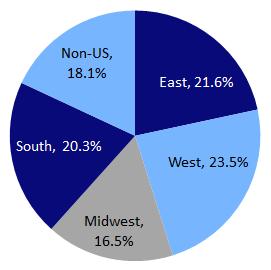
Share of US Logo Trademark Ownership, by Region (1884-2011)
In the graph above, we can see that companies in the western US have claimed the largest share of US logos, while 18 percent of logos registered in the US have foreign owners. Broken down by state, California (14.4%) is home to the most logos, followed by New York (8.8%), Florida (5.2%), and Texas (5.1%).
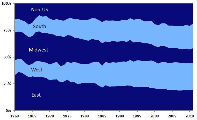
Share of US Logo Trademark Ownership, by Region
Looking at the data over time, it appears that, since 1960, the East and Midwest have lost ground in terms of their share of the nation’s logos, while the West and South have seen gains. This is not surprising, given the shifts in the US population over this period.
Further examination of the data allows for identification of content-related design trends among the logos of the different geographical regions. The following results are based on analysis of logos filed for registration over the past ten years.
East
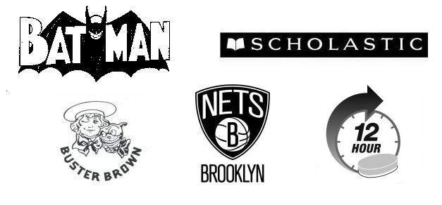
Logos of Eastern companies and organizations feature the following graphic elements at significantly higher rates than are seen in US logos as a whole:
- Basketballs: 107 percent higher than average
- Pills: 77 percent higher
- Open books: 48 percent higher
- Mythological beings/superheroes: 45 percent higher
- Dogs: 30 percent higher
West
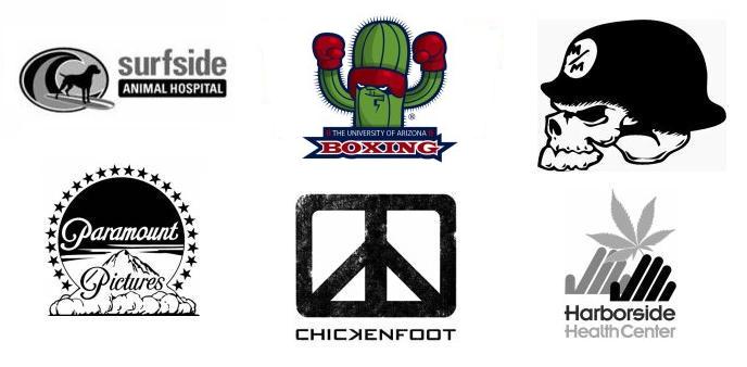
Logos of Western companies and organizations feature the following graphic elements at significantly higher rates than are seen in US logos as a whole:
- Marijuana plants: 151 percent higher than average
- Surfboards/snowboards: 123 percent higher
- Mountains: 65 percent higher
- Cacti: 61 percent higher
- Skeletons/skulls: 57 percent higher
- Peace symbols: 47 percent higher
Midwest
Logos of Midwestern companies and organizations feature the following graphic elements at significantly higher rates than are seen in US logos as a whole:
- Corn stalks: 154 percent higher than average
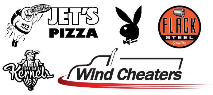
- Pizza: 116 percent higher (Domino’s and Little Caesars are based in Michigan)
- Trucks/vans: 85 percent higher
- Baseball bats: 76 percent higher than average
- Cylinders: 69 percent higher (probably due to their use in logos related to manufacturing)
- Rabbits: 67 percent higher (Playboy is headquartered in Chicago)
South
Logos of Southern companies and organizations feature the following graphic elements at significantly higher rates than are seen in US logos as a whole:
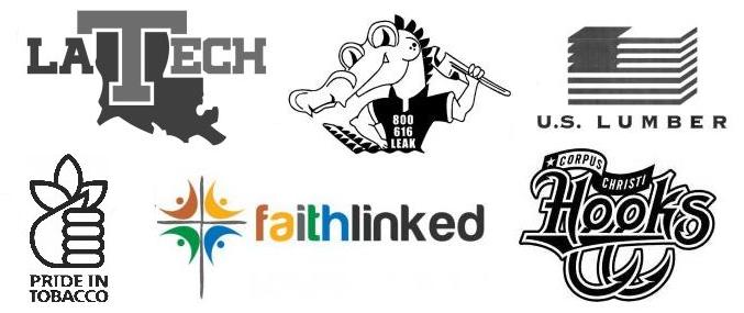
- Tobacco leaves: 121 percent higher than average
- Alligators: 69 percent higher
- States of the US (not including Texas): 67 percent higher
- Crosses: 57 percent higher
- Fishing tackle: 55 percent higher
- American flags: 36 percent higher
Foreign
Logos of Foreign-owned companies and organizations feature the following graphic elements at significantly higher rates than are seen in US logos as a whole:
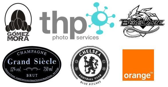
- Alcohol bottle labels: 177 percent higher than average
- Heraldic lions: 72 percent higher
- Dragons/griffons: 40 percent higher
- Three or more ovals: 39 percent higher
- Coffee beans: 33 percent higher
- Squares that are completely or partially shaded (such as the Orange mark): 19 percent higher
Foreign logos are also the most likely to contain abstract, artificial, and curved design elements.
In general, these geographic characteristics of logos are interesting, but, for the most part, not too surprising. However, some seem to cry out for explanations that are not immediately obvious. Why do Eastern logos feature so many dogs? What explains the popularity of abstract elements such as ovals and shaded squares among non-US companies? Perhaps further research may offer some answers. Do you have a theory? Contact us and share it!

