Thursday’s unveiling of Microsoft’s new logo was the biggest logo design news of the year to date. Let’s take a look at the new mark in terms of how it relates to trends in United States Patent and Trademark Office data on logo design.
Perhaps most notable is Microsoft’s switch from a logotype (or wordmark) alone to a logotype/symbol combination.
Percentage of new logos featuring logotypes and logotype/symbol combinations
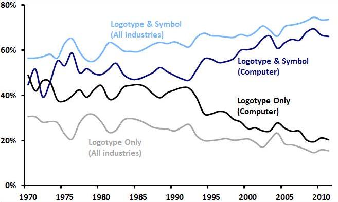 The graph above shows that among both logos in general and computer-related logos in specific, logotype/symbol combinations are becoming more popular and logotypes alone are becoming less popular (and as Emblemetric’s Logotype vs. Symbol analysis reported, logotype/symbol combinations are currently trendy, while logotypes alone are not). And although combination marks are slightly less common among computer-related logos than among logos as a whole, Microsoft’s decision to change to a logotype/symbol combination is consistent with trends both in its industry and in general.
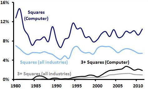
Looking at the symbol itself, it is quite simply a square element made up of smaller multicolored squares. The graph below shows the prevalence of both squares in general and groups of three or more squares as design elements in new logos over the last three decades. Data for computer-related industries is again contrasted with data for industries as a whole.
Percentage of new logos featuring “squares” and “3 or more squares” as design elements
It is apparent that squares have long been a logo design favorite for computer-related businesses. And over the last ten years, just 6.08 percent of all logos featured squares of some sort, compared to 9.62 percent of computer logos. Logos featuring three or more squares accounted for 1.05 percent of all logos, while among computer logos, the figure was double: 2.10 percent. Microsoft is certainly sticking close to industry conventions with its use of squares in its new logo.
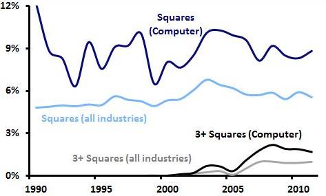
Percentage of dying logos featuring “squares” and “3 or more squares” as design elements
The graph above shows that logos with squares and 3 or more squares are not dying out (i.e., being abandoned or canceled, or expiring) at alarming rates, so Microsoft is not hitching its wagon to some fading trend with this new logo.
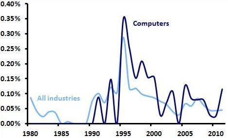
Percentage of new logos featuring red, green, blue, and yellow
Microsoft’s use of the combination of red, green, blue, and yellow in its new symbol is not typical of computer-related logos, or logos in general, for that matter. The graph above shows that the percentage of new logos featuring this combination has never approached one-half of one-percent since 1980.
But Microsoft has long associated itself with this color combination, dating back to the very first red/green/blue/yellow computer-related logo, the original Windows flag, filed for trademark registration this week in 1991. Indeed, 20.3 percent of all such logo registrations are Microsoft’s. The company’s challenge now is to “own” this combination, given that it is also used by Google and eBay.
In all, the new Microsoft logo strikes a nice balance between bringing the company’s visual image more in line with contemporary design trends and retaining distinctive elements of the Microsoft graphic identity.

