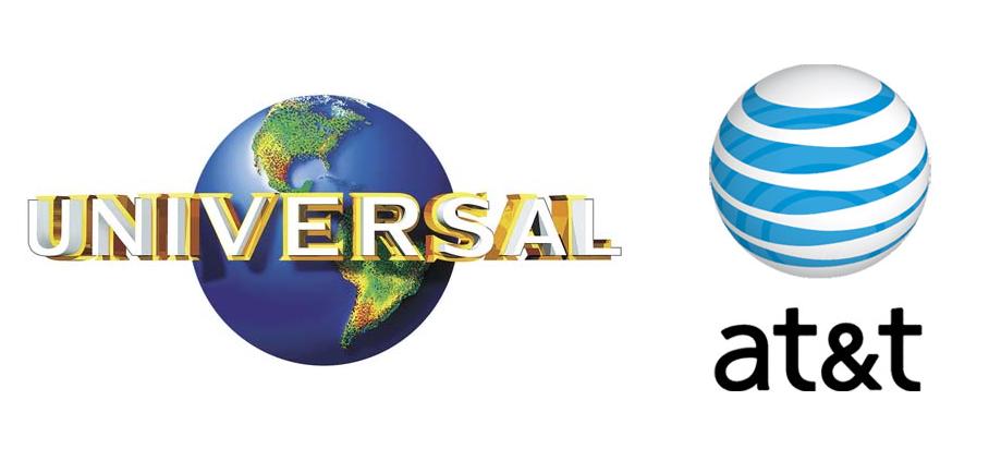
Perhaps the most significant development in twentieth-century logo design was the rise of the abstract logo. In the United States, the burgeoning corporate identity field helped spread modernist German and Swiss design philosophies, resulting in many pictorial logos being replaced by clean, stark, abstract marks. Such logos were particularly favored by expanding American corporations whose business activities, as they became more varied and technologically complex, could no longer be depicted in a simple, realistic trademark.
Abstract logos faced a strong backlash from Americans accustomed to more realistic symbols. A 1966 Printers’ Ink cover story asked whether these new trademarks were “Imagery or Tomfoolery?” In 1972, Tom Wolfe called abstract logos “the creamiest piece of pie-in-the-sky that American graphic arts have ever sold to American business” and said that they “make absolutely no impact…except insofar as they create a feeling of vagueness or confusion.” Karrie Jacobs in 1987 noted that “Logos, then, evolve backward with complex, multifaceted trademarks down in the primordial muck and geometric marks of amoebalike plainness up at the top of the ladder.”
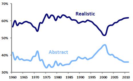
Abstract and realistic logos as a percentage of all new US logos
Analysis of United States Patent and Trademark Office data shows that the use of abstract logos peaked twice in the last half-century, although abstract logos have never been more common than realistic marks. In 1971, 42.3 percent of new U.S. logos were abstract, but that figure dropped over the next several decades.
By the mid-1990’s, abstract logos began a comeback that culminated in 2001, when 45.8 percent of new logos were abstract. This spike was almost certainly driven by the late-90’s dot-com boom and the wave of abstract swooshes that accompanied it. Look for Emblemetric to examine this trend in a future article.
The last decade has seen a significant drop in the use of abstract logos, with a corresponding increase in realistic symbols. In 2011, 36.0 percent of new logos were abstract, while 61.8 percent were realistic.
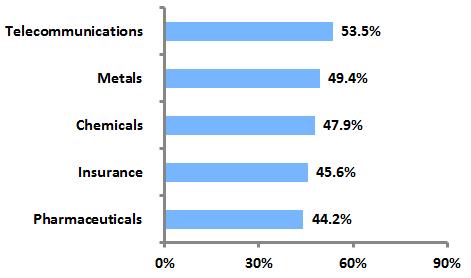
Industries with high rates of abstract logo use
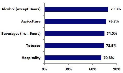
Industries with high rates of realistic logo use
The graphs above show that, not surprisingly, abstract logos are more common in high-technology industries and those where the product or service cannot be easily depicted, while realistic logos are more prevalent in industries where the product has been long established and its consumption occurs on a personal level.
Overall, whether a logo is realistic or abstract seems to have little effect on whether it survives or “dies” over time. Of the realistic logos created since 1960, 34.8 percent are still in use as trademarks, compared to 35.6 percent of abstract logos.


