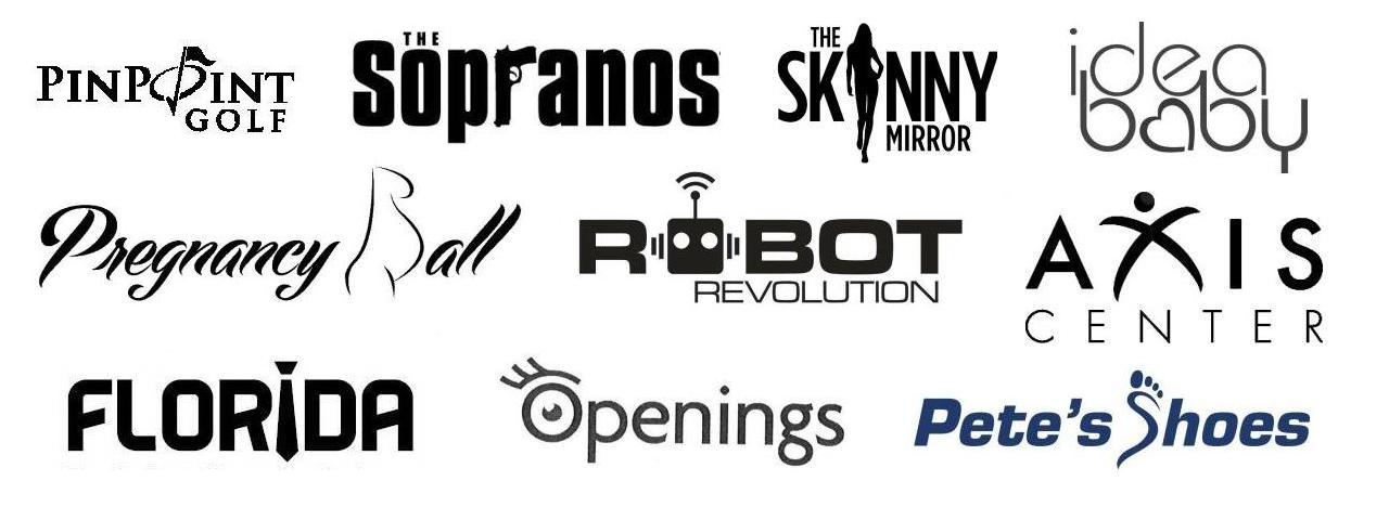
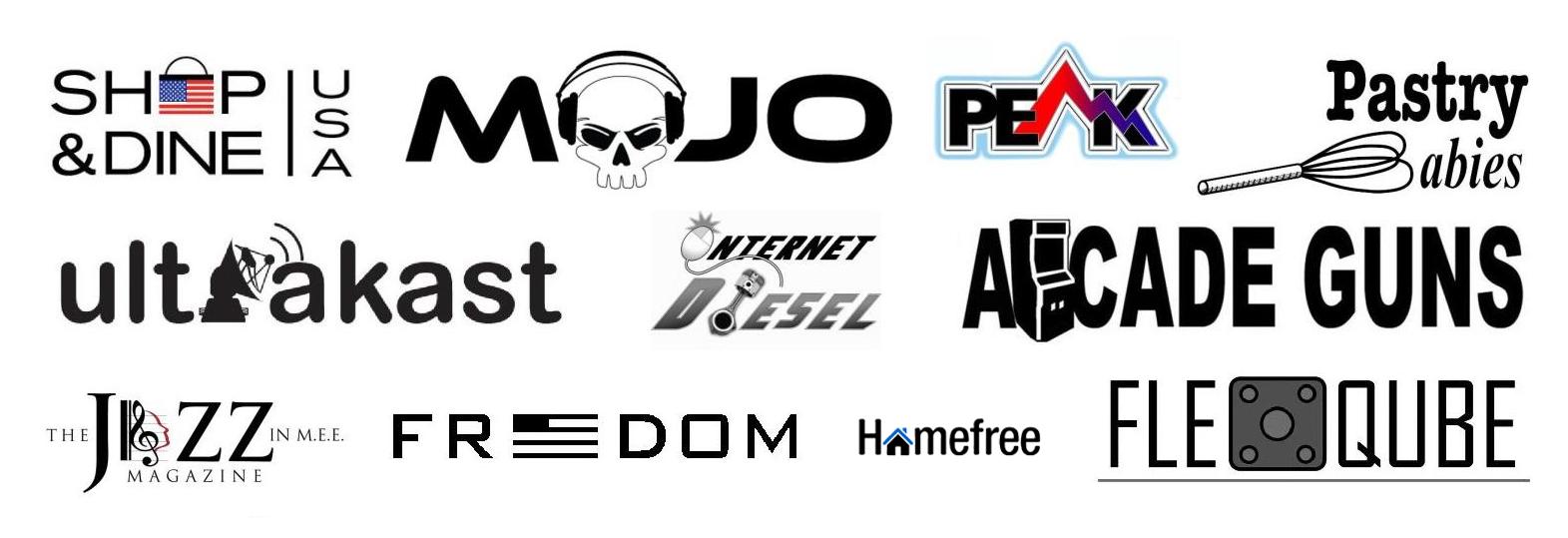
Last year, an Emblemetric analysis showed that logotype/symbol combinations were becoming increasingly popular relative to logotypes (wordmarks) or symbols alone. A prominent logo design trend among these logotype/symbol combination marks involves a wordmark in which one or more letters have been replaced with pictorial design elements. The resulting mark is neither symbol nor wordmark, but one that gives the appearance of having been cobbled together using disparate pieces, much as Frankenstein’s monster was assembled. These “frankenmarks,” if you will, have seen a resurgence in popularity over the last decade.
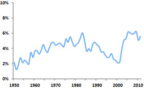
“Frankenmarks” as a percentage of all new US logos
An analysis of United States Patent and Trademark Office data shows that frankenmarks first enjoyed a period of popularity in the 1970s and 80s, peaking in 1983, when 6.04 of all new US logos were frankenmarks. After declining in prominence in the 1990s, they surged back into heavy use in the early 2000s. By 2009, they accounted for 6.21 percent of new US logos.
Among the design elements used most frequently in frankenmarks are stars (appearing in percent of 5.02 percent of frankenmarks), hearts (3.54%), and globes (2.83%), elements that are not only common symbols but that can easily stand in for commonly-used letters such as “o” and “a.” Design elements that appear in frankenmarks at a much higher rate than in logos as a whole include zippers (found in frankenmarks at a rate 4.34 times higher than in all logos), buttons (4.33 times higher), paper clips (4.18 times higher), and handcuffs (3.82 times higher).
How did the earlier period of frankenmark popularity (1975-1984) differ from the later period (2003-2011)? The particular design elements incorporated in frankenmarks changed somewhat. From 1975 to 1984, t-shirts were 5.54 times more likely to appear in frankenmarks than in the later period, while candy canes were 4.97 times more common and tridents were 3.13 times as prevalent.
From 2003 to 2011, magnifying glasses were 9.35 times more likely to appear in frankenmarks than they were in the earlier period, syringes were 4.42 times as likely, and bells were 41.5 times more common.
Interestingly, designers of contemporary frankenmarks seem to feel less need to have the pictorial elements of their logos correspond graphically to the letters they are replacing. This results in marks that a viewer reads by essentially “filling in the blanks” to account for the missing letters. While this is not typically a problem when the mark uses common words, legibility of less-well-known words or brand names may be threatened.
All in all, frankenmarks often seem to reflect a certain design amateurishness. Their designers’ attempts to combine wordmarks with symbols are frequently clumsy and overreaching, resulting in marks that can appear cheap and gimmicky. They rarely exude a sense of permanence and they don’t seem to last in use: indeed, of the logos filed between 2003 and 2011, 36.4 percent of the frankenmarks have “died,” compared to just 32.8 percent of the other logos. Those looking for a new logo should think carefully before adopting a frankenmark.


