A prominent contemporary logo design trend has featured an “X” with letters or symbols in each of the four quadrants it forms. While today the trend is often associated with a “hipster” aesthetic, its origin was recently pinpointed by Sue Apfelbaum in Red Bull Music Academy Magazine within the hardcore and straight-edge punk scenes of the 1980s, as kids appropriated the X that was written on their hands to mark them as underage at shows.
The trend has perhaps tired itself out at this point, becoming ripe for parody from the “Your Logo is Not Hardcore” Tumblr and the 2013 Brand New Conference identity. But, as noted by Bill Gardner in his 2013 Logo Trends article on Logolounge, a variant of the trend has emerged in which the X’s are made up of crossed design elements such as tools, cooking utensils, and sporting goods, as well as the more traditional swords and bones.
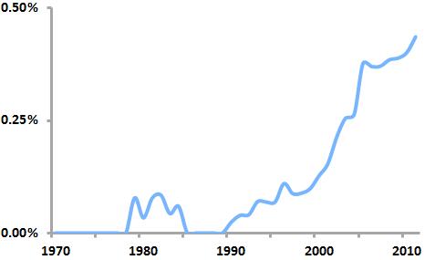
“Crossed” logos as a percentage of all new US logos
By analyzing United States Patent and Trademark Office data on logo registrations, we can see that this “crossed” logo trend is real, having taken off in the early 2000’s and continuing today to the point that nearly one out of every 200 new logos features some sort of crossed element.
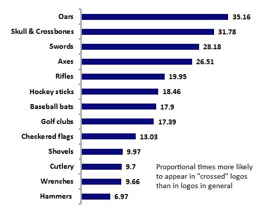
Popular design elements within “crossed” logos
Further analysis shows that oars are the design element most likely to be crossed, as they appear in crossed logos 35 times more often than they do proportionately in logos as a whole. Gardner’s observations are borne out as well, as axes, golf clubs, cutlery, wrenches and the like round out the list of frequently crossed elements.
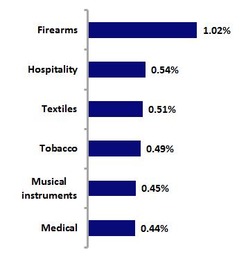
Industries with the highest percentages of “crossed” logos
Analysis by industry shows that firearms logos are the most likely to contain crossed logos; this is not surprising given that rifles are a frequently crossed element. History suggests, though, that the “industry” that first gave birth to this crossed look, though, may be the stonemasonry of the Romanesque and Gothic periods, as the personal seals of the masons often incorporated it.
So this logo design trend is both old and new, but its future is somewhat doubtful. Analysis of the “birth” and “death” rates of crossed logos over the past five years shows a “trendiness” measure of 0.99, which, because it is (barely) below 1, indicates that crossed logos make up a greater percentage of “dying” logos than of new logos. This pattern appears likely to not only continue, but to accelerate, leading to the demise of the trend.


