Trademarks’ Coming-Out Party

trademarks usa

James I. Bowie

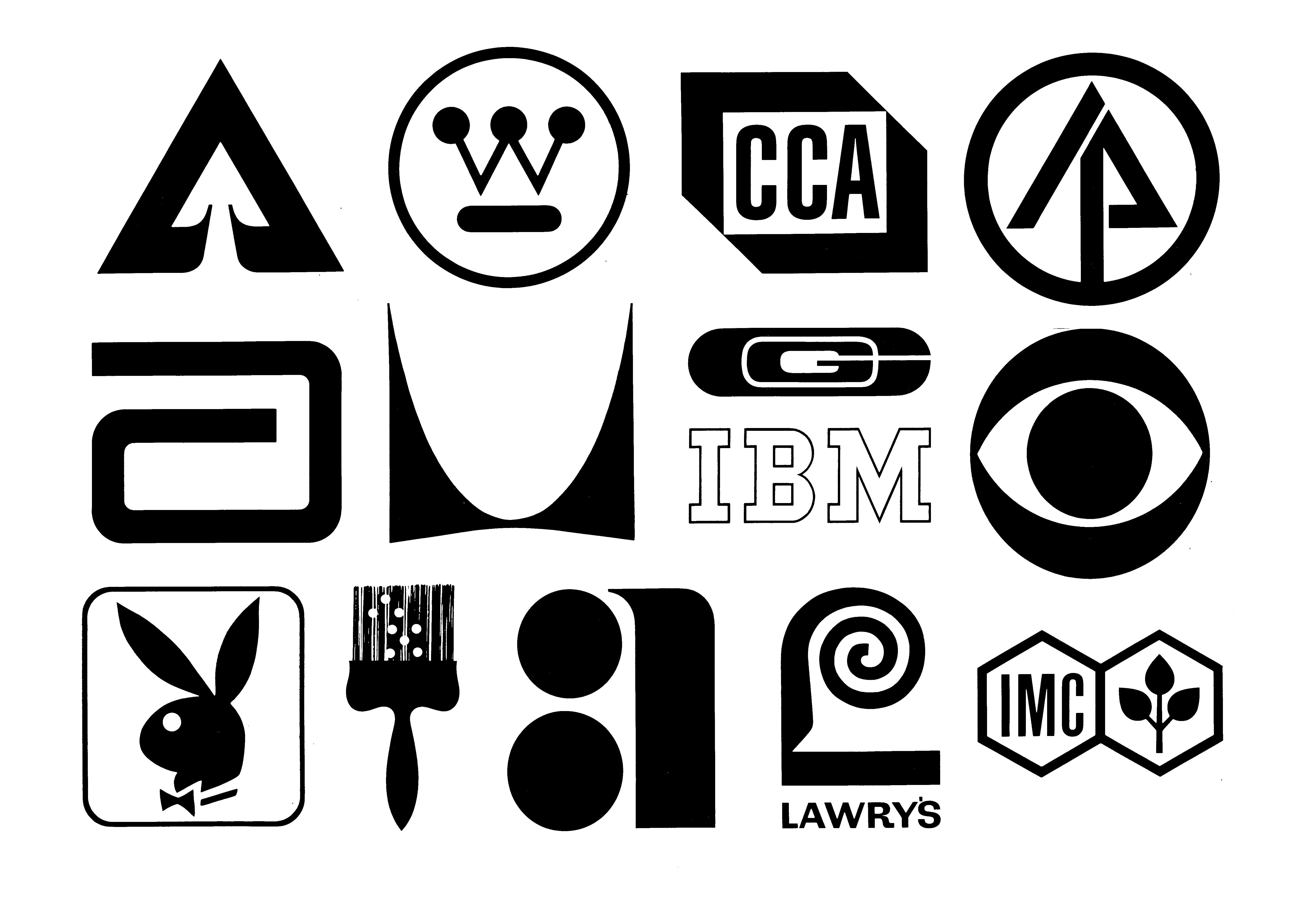
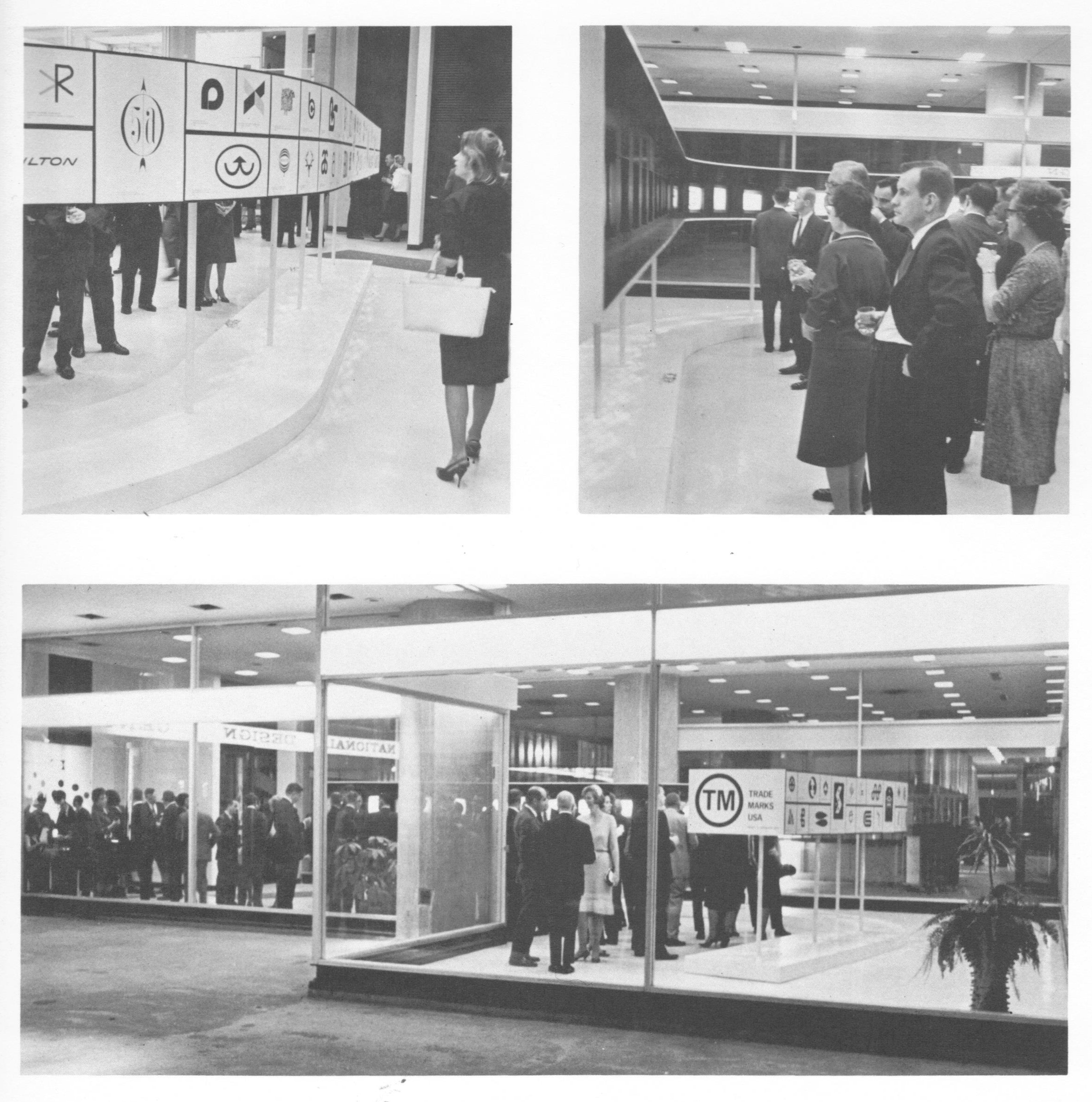
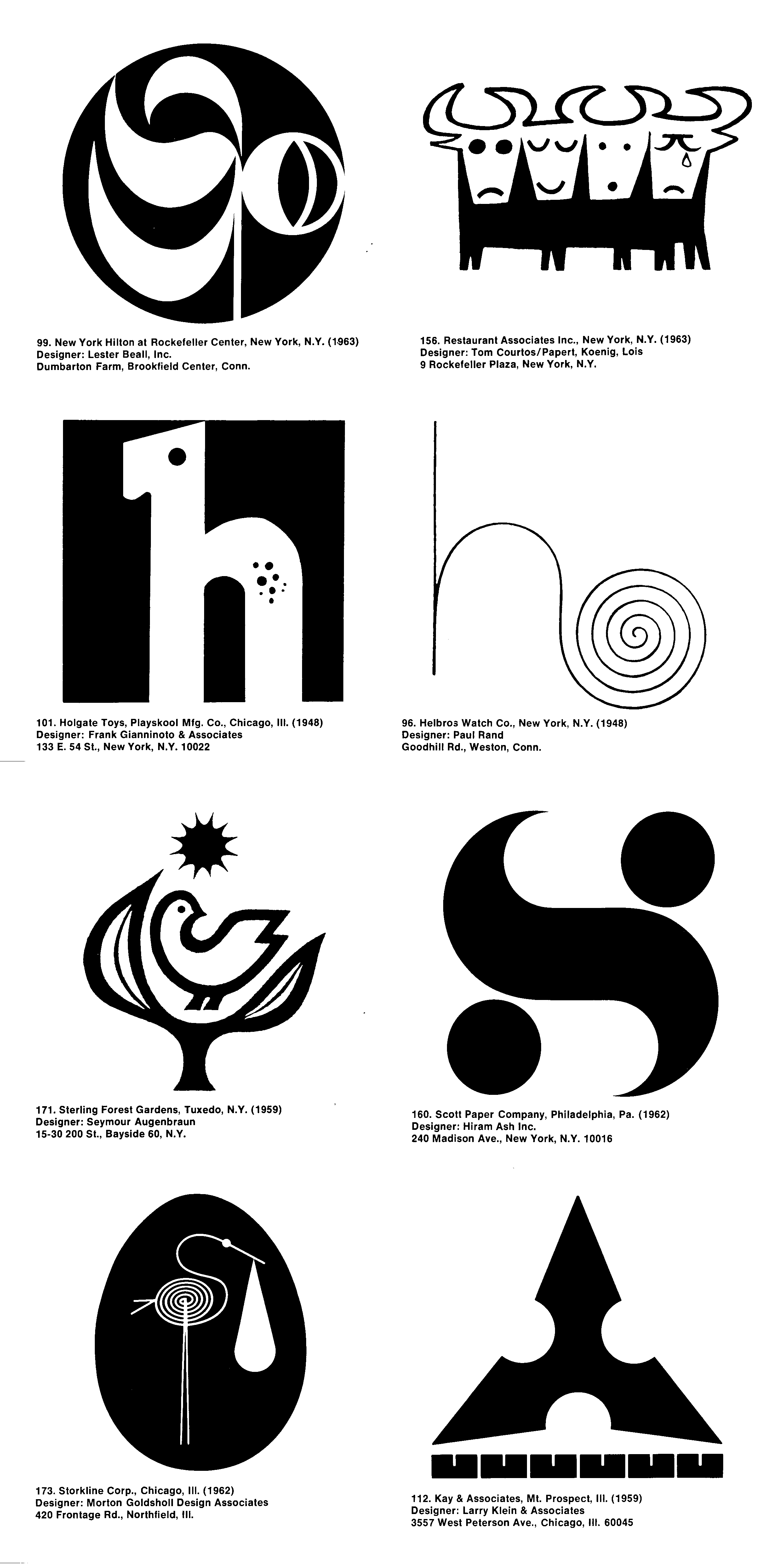
Fifty years ago, on April 22, 1964, Trademarks/USA, the first national retrospective logo design exhibit, opened at the National Design Center in Chicago’s just-completed Marina City towers. The exhibition, hosted by the Society of Typographic Arts, featured 193 American trademarks from the period 1945-1963, chosen from over 1,600 entries by a seven-member jury that included Lester Beall and Egbert Jacobson. The fourteen marks shown above were chosen for particular distinction by the jury.

This event was perhaps the high point of a period in which logos were receiving unprecedented attention from both the business world and the public at large. “Today’s corporate logo or trademark is almost as important as the balance sheet,” gushed the Chicago Tribune in its coverage of the exhibition. That logos would be exhibited in the manner of fine art would have seemed ludicrous only a few years before, yet in the Mad Men mid-sixties, as the field of corporate identity emerged and the importance of a company’s image to its marketing became heightened, logos had acquired a hip, modernist cachet.

This was reflected in the marks selected for Trademarks/USA, as 69 percent of them were from 1960 or later. (Almost as interesting as the logos chosen for the exhibition are the familiar ones not picked, including Paul Rand’s ABC and UPS marks, Lippincott and Margulies’ Steelmark and Chrysler Pentastar, the Coca-Cola script, Raymond Loewy’s Nabisco triangle, and the venerable General Electric logo.)

trademarks_usa

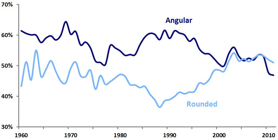
Exhibition chairman Larry Klein characterized the logos on display as “simpler, blacker, more geometric and formal and sometimes more even in color and weight of line…marks–both good and bad–are growing very much stronger and bolder.” These trends are obvious in a casual perusal of the exhibition catalog, published in 1968.

trademarks_usa_logos

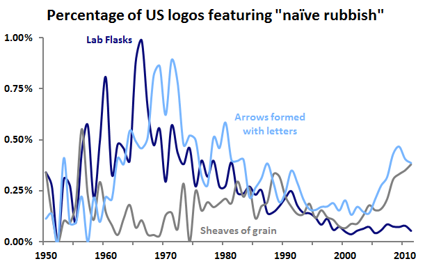
In tallying up selected design characteristics of these 193 marks and comparing them to all US logos filed for registration with the United States Patent and Trademark Office since 2000, further trends become apparent.

trademarksusa

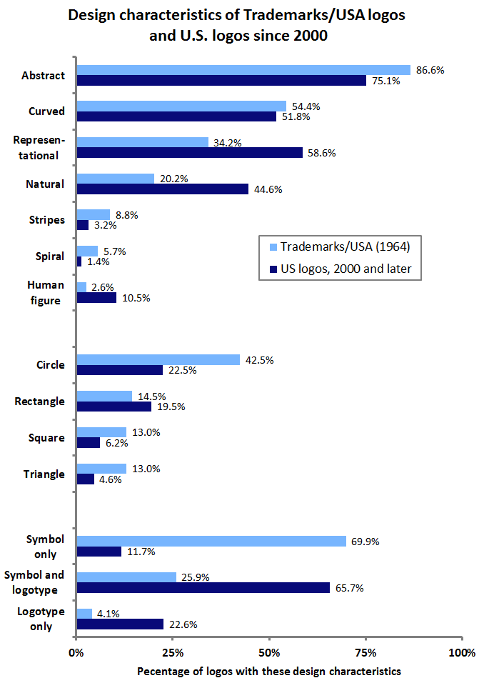
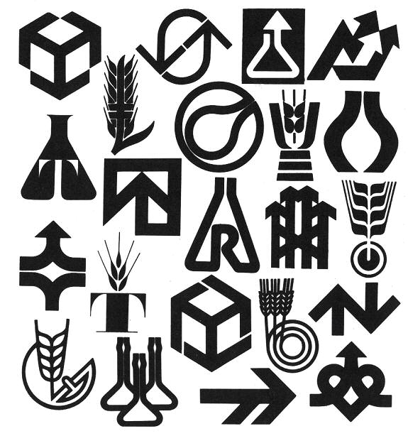
The Trademarks/USA logos were, in comparison to today’s logos, more abstract, far less representational, and much less likely to contain human design elements or those related to nature. Geometric shapes such as circles, squares, and triangles were in abundance, and unaccompanied symbols were the norm, as logotypes, either with symbols or alone, were much less common than they are today.

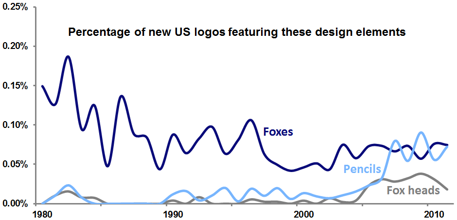
Spirals were a particularly trendy element among the exhibition’s logos, perhaps inspired by Paul Rand’s 1948 Helbros Watch mark. And while representational marks were rare, fully 12 percent of them featured birds, compared to less than five percent of modern representational logos. Perhaps the most striking trend among the Trademarks/USA selections was the tendency to portray, often through clever design, an initial letter or letters; nearly half (45.6%) featured such a graphic element.

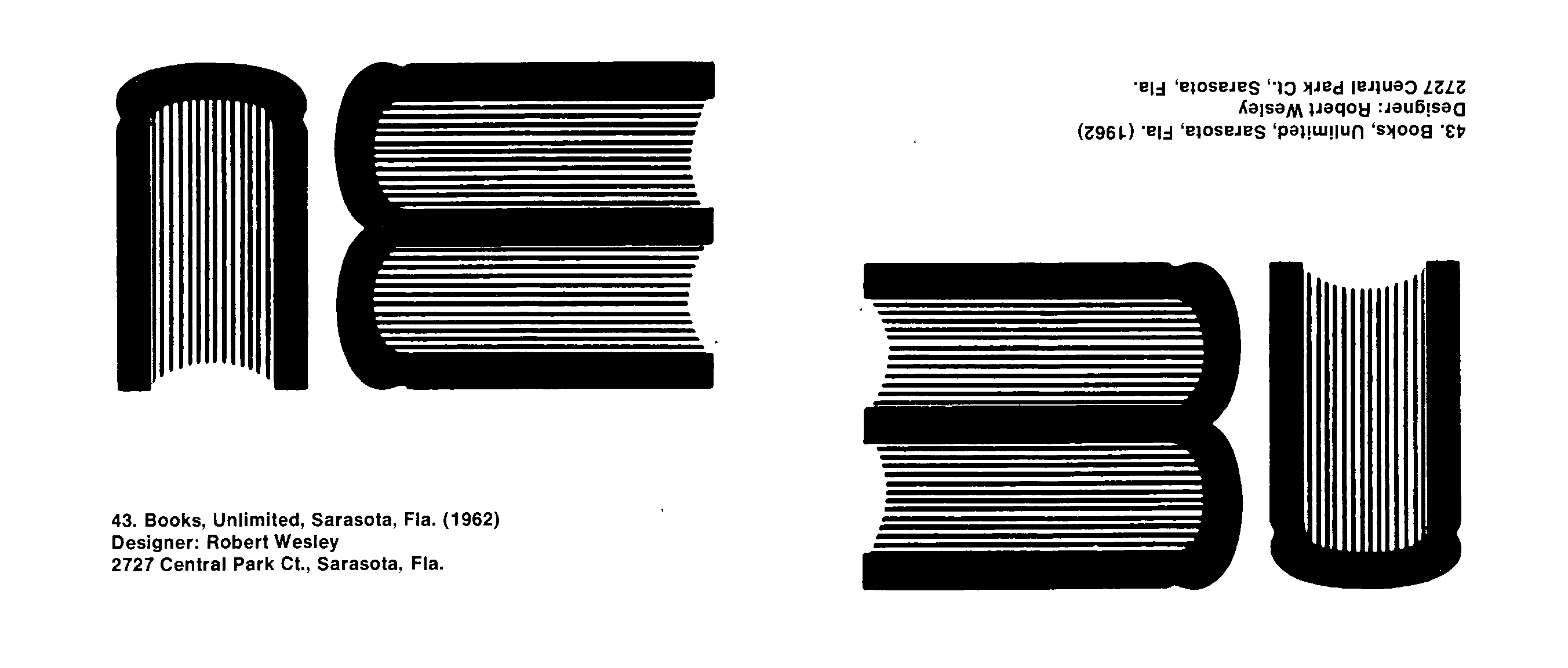
One such logo was the Books Unlimited mark (below), which seemingly used a side view of three books to form the BU initials. Yet, like the old joke about no one noticing the modern abstract painting hanging upside-down in the gallery, this logo appears to have been inverted in the Trademarks/USA catalog.

booksunlimitedlogo2

This blunder might be seen as prescient, as, in the years following Trademarks/USA, the shine came off the clean, abstract, modernist logo to some extent. Critics of this style of logo became louder over the remainder of the 1960’s and into the 1970’s as the overuse of simple, stark, geometric forms in logo design led to a glut of indistinct, meaningless, and look-alike marks. Still, the Trademarks/USA exhibition was a clear sign of the growing importance of logos and graphic design in American business and culture.

Wally Olins Remembered

wallyolinslogos

“Banal and trite” logos, from The Corporate Personality, p. 188

James I. Bowie

Corporate identity legend Wally Olins died Monday at 83 after a brief illness. Here at Emblemetric, we remember fondly his 1978 book The Corporate Personality, in which he unleashed a scathing criticism of the clichéd logo design trends of the day:

Why are graphic designers still busily scribbling away at stylised flasks symbolising the powerful modern chemical company busying itself with Man’s Future but human enough to remember its Humble Origins? Why are they still producing stylised sheaves of some unspecified grain for food companies, indicating that the organisation has an involvement of however remote a kind with agriculture and Dear Old Dame Nature Herself by whose Bounty we all live? Above all, why are they still churning out these symbols consisting of initial letters tormented into a bizarre shape and ending with an arrow, preferably pointing upwards and slightly to the right, indicative of Progress, Dynamism and a controlled but powerful thrust towards what is clearly a Better and Brighter Future?

Why is it that the design idea that ultimately emerges is so often banal and trite? Is this naïve rubbish the best that we can do?

— Wally Olins, The Corporate Personality: An Inquiry Into the Nature of Corporate Identity, page 188

In honor of Mr Olins, let’s take a look at how those logo design trends have shown up in US logo design over the years, by analyzing logo design data from the United States Patent and Trademark Office.

naiverubbish

When Olins launched his broadside in 1978, the laboratory flask logo design trend was already on its way out, and such flasks are rarely seen in logos today. Arrows formed with letters were similarly on the decline in 1978, although they saw a resurgence in the last decade. Sheaves of grain were seemingly never as common as Olins seemed to think, and are also on the rise among today’s logos. Hopefully, they are being used in a way that is neither banal nor trite.

FiveThirtyEight’s New Logo, by the Numbers

538

James I. Bowie

The new incarnation of Nate Silver’s FiveThirtyEight website made its ESPN-affiliated debut last week, to the delight of data nerds everywhere, including here at Emblemetric. The site promises to expand FiveThirtyEight’s data journalism beyond politics and into the worlds of sport, economics, and popular culture. With the new website came a new logo, a stylized fox head, known in house as “Fox No. 9,” that Silver says is intended to be emblematic of FiveThirtyEight’s pluralistic approach, as expressed in the old saying “the fox knows many things, but the hedgehog knows one big thing.” While the choice of a fox seems somewhat curious given that one of the biggest hedgehogs in Silver’s sights is Fox News, and while some have questioned whether Silver got the fox/hedgehog analogy correct, the new fox logo represents a big step up from the one used during FiveThirtyEight’s New York Times days, a calculator spewing out an American flag:

 Five-Thirty-Eight

The new logo, designed by Michael Meyers under the guidance of FiveThirtyEight creative director Kate Elazegui, is a handsome one, and has the added bonus of looking like a pencil, a tool that holds a nostalgic resonance for the nerd. Let’s turn the tables on FiveThirtyEight and subject Fox No. 9 to some quantitative analysis, using data on trademark design from the United States Patent and Trademark Office.

foxpencil

While the use of foxes in US logos has tailed off over the last several decades, fox heads in particular have enjoyed a bump in popularity recently, and logos featuring pencils are also in vogue. The fox head logo trend has resulted in a number of recent trademarks that seem to anticipate the look of Fox No. 9:

foxes

A deeper understanding of how FiveThirtyEight’s logo fits with recent trends can be gained by measuring the “trendiness” of particular design elements. This is done by calculating the share of an element’s use in new logos relative to the share of its use in dying logos. If a design element appears in the same percentage of new and dying logos, its ratio is 1, meaning that it is not at all trendy in a positive or negative way. However, if an element were used 80 percent of the time in new logos and just 40 percent of the time in dying logos, its ratio would be 2, meaning that it would be very “hot.” For the period 2005-2011, the trendiness measure for fox heads is 1.72; for pencils, it is 1.77. FiveThirtyEight seems to have hit upon a couple of very hot logo trends in its design.

Aside from the logo, an interesting choice in the new site’s branding was the decision to stick with the “FiveThirtyEight” name (which comes from the number of members of the US Electoral College) over the shorter “538,” which Silver occasionally uses (his new Twitter handle is @NateSilver538).

Since 1990, there have been almost 1.1 million wordmark logos filed as trademarks in the US. Of these, 3.3 percent have been wordmarks that are three characters in length, like 538, and 3.2 percent have been wordmarks that are fifteen characters long, like FiveThirtyEight. Of all of the post-1990 wordmarks, 44.1 percent have survived in use to the present day.  Of the three-character wordmarks, 49.4 percent have survived, while only 42.1 percent of the fifteen-character wordmarks are still in use.

In sticking with its fifteen-character wordmark, FiveThirtyEight has thrown caution to the wind, disregarding the sort of quantitative insight that is its bread and butter. Here’s hoping the site will prosper nevertheless.

Counting Neutered Sprites

sprites

James I. Bowie

In April 2009 Michael Bierut wrote on Design Observer of a “plague” of “sexless, blankly cheerful little people” in contemporary logo design. The piece, titled “Invasion of the Neutered Sprites,” struck a chord among designers, many of whom lamented the ubiquity of the abstract figures and vowed to abstain from what they viewed as an out-of-control, hopelessly clichéd logo design trend.

Five years later, it is possible to analyze data from the United States Patent and Trademark Office to assess the impact of this trend. Was it really as widespread as Bierut and others made it out to be?

sprites1

Yes it was! It turns out that Bierut was writing in the veritable heyday of the Neutered Sprite, as the innocuous logo design elements were rocketing to previously unseen levels of popularity. Their use in US logos shot up in 2006 and 2007, before peaking in 2008, when they could be found in 1.15 percent of all new logos, and they made up 11 percent of all logos featuring human figures.

sprites3

Bierut asserted that “the traditional habitat of the Sprites today, of course, is Nonprofitland. Finding them isn’t hard. Look for logos for organizations dedicated to community-building, or health-supporting, or any kind of relentlessly positive thinking.”  Indeed, analysis shows that sprites are most common in the medical field, as well as in the personal services industry, and in education. They have yet to invade the firearms business, however.

What is behind the Neutered Sprites trend? We can only speculate. It may have to do with the increasing propensity in recent years of nonprofit organizations to adopt the branding and identity strategies that were already well-established in the for-profit world. The Neutered Sprite represents a handy graphic peg on which these organizations can hang their new identities.

Another factor may be a pent-up desire for more humanity in logos. Since the sixties and seventies, when modernist logo design had, in the eyes of a number of designers and critics, devolved into a meaningless amalgam of cold, abstract forms, many have called for a return to a warmer, more personal style of logos. In an age of economic and political uncertainty, as companies seek to appear less foreboding and more approachable, the Neutered Sprite may represent an attempt to inject a human element back into logos. Yet it is an unsuccessful attempt, as the design cannot escape the overly-abstract tendencies of its predecessors.

In fact, in looking again at these Sprites, it seems possible that they have evolved from the “swoosh” logos of the late-nineties dot-com boom. They are perhaps nothing more than anthropomorphic swooshes.

Essential to both the swoosh and the Sprite is the notion of curvedness:

sprites4

Analysis shows that Sprites are far more likely to be curved than are other logos depicting humans or logos in general. As Emblemetric recently discussed, rounded and curved logos have been replacing angular marks, and Neutered Sprites live on as a big part of this movement.

Yahoo’s Logo, by the Numbers

yahoologo

James I. Bowie

Later this week, Yahoo will unveil a new logo, replacing the wordmark (above) that has remained virtually unchanged since 1996, aside from a 2009 switch from red to purple. Leading up to this unveiling, Yahoo has been featuring a new logo every day in its “30 Days of Change” campaign. Yahoo’s Chief Marketing Officer Kathy Savitt has already revealed that the new mark will retain the color purple and the “iconic” exclamation point, and each of the “30 Days” logos has simply been a wordmark rendered in a different typographic style, so it seems that the change will not be a drastic one.

The month-long buildup to the new logo’s debut has succeeded in attracting interest and, by easing people into the idea of change, has perhaps served to prevent a Gap-style backlash. Speculation about the new logo has focused on Yahoo CEO Marissa Mayer’s inclination toward data-driven design decision-making, with particular attention paid to her famous test of 41 shades of blue at Google. Indeed, Yahoo seems to have tested new logo designs on its site in 2008 and 2012 (below), so this week’s change should not come as a big surprise.

tests

Analysis of United States Patent and Trademark Office data on logo designs can allow us to see where the current Yahoo logo stands in relation to nationwide and industry-wide logo design trends.

The Yahoo name, an acronym for “Yet Another Hierarchically Officious Oracle,” is a nerdy joke that probably shouldn’t have survived the nineties, but is far too familiar to change now. Its exclamation point is certainly one of Yahoo’s most distinctive brand elements. Given that “Yahoo!” is itself an exclamation, it’s not surprising that it is there. Companies previous to Yahoo certainly felt inclined to include it in their logos in 1985 and 1988:

uryahoos

Over the years, wordmarks (that is, logos that are words presented in a stylized form) ending in exclamation points have become increasingly common, as the graph below illustrates. Currently, 1.17 percent of new wordmarks end with an exclamation point, while among internet wordmarks, the figure is 1.52 percent. Yahoo certainly seems to have been a trendsetter here, part of a 1995 spike in which 2.42 percent of all new internet wordmarks ended with exclamation points.

Percentage of new wordmarks ending in exclamation points

exclaimovertime

And, as shown below, internet firms are significantly more likely to use wordmarks ending in exclamation points than are companies in many other industries.

Percentage of wordmarks ending in exclamation points in selected industries

exclaimbyindustry

In all though, the exclamation point belies a certain cheesiness and feels like a cheap marketing gimmick. While Yahoo presents an exception, in general, wordmarks ending in exclamation points tend not to last: of the wordmarks filed for registration with the USPTO since 1990, 44.1 percent have survived in use to the present, while just 39.2 percent of exclamation point wordmarks are still around.

After wavering for years between red and purple, Yahoo has gone “all in” on purple as its defining color. Purple is certainly an “ownable” color for Yahoo in that it is relatively rarely used in the corporate world. The graph below shows that purple has consistently appeared in only about five percent of US logos over the past several decades. Among new internet-related logos, the use of purple shot up to 9.52 percent in 1996, another spike that Yahoo certainly contributed to. Today, purple is found less often among internet logos than in logos as a whole.

Percentage of new logos featuring the color purple

purplebyyear2

Further analysis shows that, across time, purple appears most often in the logos of medical and pharmaceutical companies and less often in internet logos.

Percentage of logos featuring purple in selected industries

Purplebyindustry

Yahoo’s apparent decision to stick with a wordmark-only logo (as opposed to a symbol-only or symbol-plus-wordmark logo) runs against contemporary logo trends. While Microsoft, last year’s most prominent new logo adopter, opted to ditch its wordmark for a wordmark/symbol combination, Yahoo seems to be standing pat. Although its “Y!-bang” mark might be considered a symbol of sorts, it hasn’t been used very prominently to date. Analysis of USPTO data shows that, among new wordmarks today, only about one-fifth stand alone without a symbol. The figure is slightly lower for internet wordmarks, which have seen a steep dropoff in solo wordmarks since the dot-com boom of the late nineties.

Percentage of new wordmarks unaccompanied by a symbol

wordmarksovertime

Indeed, internet wordmarks are among the least likely to be unaccompanied by a symbol, meaning that Yahoo is going against the industry trend.

Percentage of wordmarks unaccompanied by a symbol in selected industries

wordmarksbyindustry

The three main characteristics of Yahoo’s current logo (purple, solo wordmark, ending with an exclamation point) saw higher levels of popularity among internet-related logos in the late 1990s, implying that Yahoo’s image may be tied to that time period, and suggesting that the company is indeed in need of an updated logo. But all three of these characteristics seem likely to remain prominent in this week’s new logo. To enable Yahoo to escape the dot-com era look, the typographical changes incorporated in the new logo will have to be quite strong.

Logos Turning ’Round

roundedlogos

James I. Bowie

One of the most fundamental dichotomies in logo design lies between angular and straight design elements and those that are rounded and curvilinear. While the former suggest qualities of precision, strength, and solidity, the latter are associated with softness, friendliness, and nature.

In recent years, it has been argued that more rounded forms have come into vogue in logo design. Identity guru Tony Spaeth noted in 2006 that “soft, shaded, rounded, and multicolor marks, enabled by technology, are in fashion.” In a 2009 Brandweek piece, Todd Wasserman wrote that “as the economy gets uglier, logos are getting prettier. The stolid angular look of visual trademarks like IBM’s and Bank of America are being supplanted by ones that sport softer, more approachable fonts, multiple colors and natural, child-like symbols.” The article quoted adman Cal McAllister, who said that “when you see a logo that’s boxy and the edges are hard and sharp, and the company just laid off 10,000 people, you get mad at them. But if it’s a watercolory rounded logo, you feel kind of sorry for them.”

 Percentage of US logos with angular and rounded design elements

angularrounded3

Analysis of United States Patent and Trademark Office data confirms that the perceptions of this logo design trend are correct. Historically, US logos have been more likely to contain angular elements than rounded elements. This was most evident in 1989, when 62 percent of new logos featured angular elements, while only 39 percent had rounded elements. But throughout the 1990s and early 2000s, rounded logo design elements steadily increased in popularity, while angular ones dropped off. Finally, in 2005, rounded elements gained the upper hand. Perhaps part of the reason for the hostile reaction to 2007’s unveiling of the jagged London 2012 mark was that it stood in utter contrast to the prevalent trend of roundedness.

Logo design trends such as this one are not easily explained. As previous Emblemetric analysis has shown, circles had become more popular than rectangles. And it is likely that as many high-tech companies sought to move away from images of cold technical perfection toward those of more humanity and relatability, they abandoned their hard-edged logos for more rounded forms. Apple was certainly a pioneer in this regard, and the onslaught of logos containing swooshes in the late-1990s dot-com boom showed that tech companies were no longer afraid of curves.

Prevalence of angular and rounded logos, by industry

angularroundedindustry

Further analysis shows that the roundedness and angularity of logos varies widely by industry. More human-centered industries like medical services and hospitality are the most likely to feature rounded logo design elements, while more technical industries like insurance, finance, and building materials exhibit the most angular logos.

Will this logo design trend swing back the other way, toward angularity? Perhaps as the worldwide economy recovers, consumers will feel less of a need for the comfort of rounded, huggable marks and more of a desire for logos with confident, aggressive lines and sharp edges. But for now, curviness rules.