Crossed Up

crossed

James I. Bowie

A prominent contemporary logo design trend has featured an “X” with letters or symbols in each of the four quadrants it forms. While today the trend is often associated with a “hipster” aesthetic, its origin was recently pinpointed by Sue Apfelbaum in Red Bull Music Academy Magazine within the hardcore and straight-edge punk scenes of the 1980s, as kids appropriated the X that was written on their hands to  mark them as underage at shows.

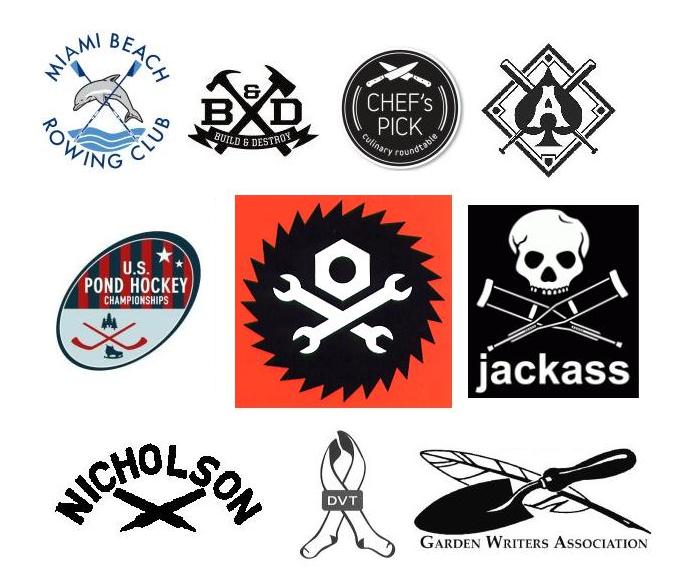
The trend has perhaps tired itself out at this point, becoming ripe for parody from the “Your Logo is Not Hardcore” Tumblr and the 2013 Brand New Conference identity. But, as noted by Bill Gardner in his 2013 Logo Trends article on Logolounge, a variant of the trend has emerged in which the X’s are made up of crossed design elements such as tools, cooking utensils, and sporting goods, as well as the more traditional swords and bones.

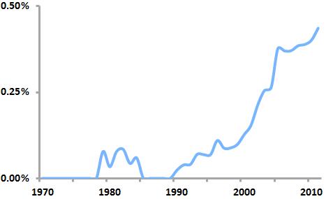
“Crossed” logos as a percentage of all new US logos

crossedlogos1

By analyzing United States Patent and Trademark Office data on logo registrations, we can see that this “crossed” logo trend is real, having taken off in the early 2000’s and continuing today to the point that nearly one out of every 200 new logos features some sort of crossed element.

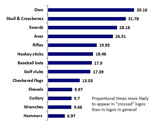
Popular design elements within “crossed” logos

crossedlogos2

Further analysis shows that oars are the design element most likely to be crossed, as they appear in crossed logos 35 times more often than they do proportionately in logos as a whole. Gardner’s observations are borne out as well, as axes, golf clubs, cutlery, wrenches and the like round out the list of frequently crossed elements.

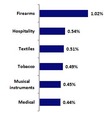
Industries with the highest percentages of “crossed” logos

crossedlogos3

Analysis by industry shows that firearms logos are the most likely to contain crossed logos; this is not surprising given that rifles are a frequently crossed element. History suggests, though, that the “industry” that first gave birth to this crossed look, though, may be the stonemasonry of the Romanesque and Gothic periods, as the personal seals of the masons often incorporated it.

So this logo design trend is both old and new, but its future is somewhat doubtful. Analysis of the “birth” and “death” rates of crossed logos over the past five years shows a “trendiness” measure of 0.99, which, because it is (barely) below 1, indicates that crossed logos make up a greater percentage of “dying” logos than of new logos. This pattern appears likely to not only continue, but to accelerate, leading to the demise of the trend.

Procter & Gamble’s New Logo, by the Numbers

Print

James I. Bowie

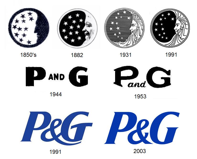
Procter and Gamble, the world’s largest consumer packaged goods company, earlier this year quietly rolled out a new logo from Landor Associates. The lack of fanfare was understandable, given P&G’s history: the company unsuccessfully battled outlandish rumors that its century-old “Man in the Moon” logo was satanic, finally removing the mark from its packaging in 1985. Since 1991, the company has relied on basic “P&G” logotypes; the new logo puts the type in a circle of P&G’s traditional dark blue and recalls the old mark with a light blue crescent shape.
pg

The old logo was not without its weaknesses. P&G had always had great success promoting its famous brands (Ivory soap, Tide detergent, Crest toothpaste, etc.) much more heavily than itself, so the Man in the Moon mark, appended at small size to obscure parts of the product packaging, was unfamiliar and meaningless to the consumer. It practically invited people to come up with an interpretation for it, and they did, to disastrous effect. (Ironically, P&G had briefly stopped using the symbol in the 1860’s, considering it “meaningless,” but quickly reconsidered when a merchant rejected as “not genuine” a shipment of candles that lacked the mark.)

The logo had been redesigned by sculptor Ernest Haswell in 1931 in an ornate style out of step with modern marks. As early as 1961, Modern Packaging magazine had called it “tiny, oddly out-of-date and almost unnoticed.” In 1991, corporate identity guru Tony Spaeth, citing its “visual weakness,” used it to illustrate the point that “sometimes the logo is indeed a problem, if not the problem” with corporate identity.

The new P&G logo represents part of the company’s effort to increase its profile. As Landor puts it in describing the mark, “For the first time, P&G is starting to talk to consumers as one company, not just as individual brands, in an effort to build awareness and trust.”  Internally, the mark is cleverly being called the “New Phase” logo, in a reference to both the new awareness campaign and the phases of the moon (although, unfortunately, while the old Man in the Moon symbol depicted a waxing moon, one that is growing in size, the New Phase logo shows a waning moon that is fading into nothingness).

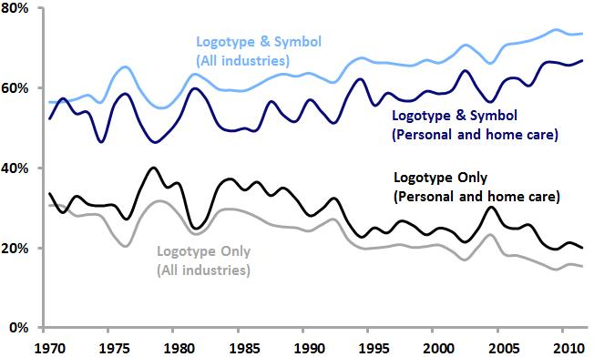
The most obvious change from the most recent logo to the New Phase mark is the switch from logotype alone to symbol with logotype. As we saw last year with Microsoft’s new logo, and with logos in general, such a switch is quite common today. Analysis of United States Patent and Trademark Office data on logos bears this out.

Percentage of new logos featuring logotypes and logotype/symbol combinations
PG logotype symbol trends

Among all US logos as well as logos within the personal care and home care industries that P&G is a part of, logotype/symbol combinations are increasing in popularity, while logotypes alone are becoming less common. P&G’s adoption of this new logotype/symbol combination is squarely in line with current logo design trends.

Percentage of new US logos featuring specific design elements
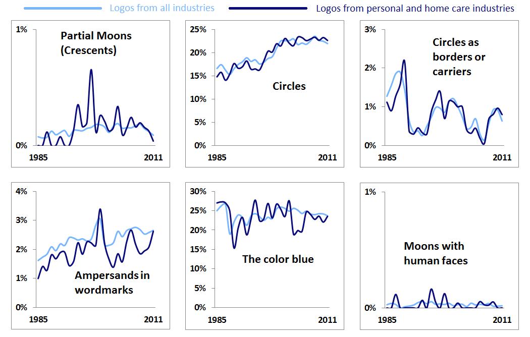
pgtrends

Looking at the individual elements that make up the New Phase identity, it appears that crescent moons and circles as borders or carriers are not particularly popular today either among logos as a whole or within the personal and home care industries (and Man in the Moon-style lunar faces are practically nonexistent). However, as noted here last year, circles are enjoying renewed popularity in logos and blue has equaled red as the color used most often in logos. The use of ampersands in wordmarks is on the rise as well (a trend that is often reflected in the graphic design world’s own logos).

We may extend our analysis by looking at the “trendiness” of the design elements associated with the new P&G logo, which can be measured as a ratio of the share of each element among new logos from the last five years to the share of each element among “dying” logos over the same period. Using such a measure, values above 1 indicate design elements that are relatively “hotter,” while values below 1 suggest “colder” design elements.

    “Trendiness” of design elements, 2007-2011
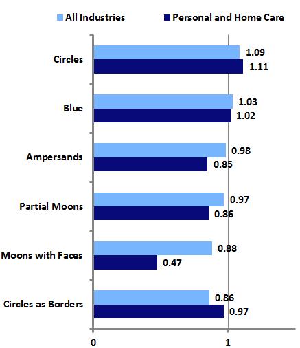
pgtrendy

The most prominent aspects of the New Phase logo, the circle and the color blue, are currently somewhat trendy, suggesting that P&G and Landor have created an identity that, while certainly not groundbreaking, is appropriate for a large, conservative company seeking a refreshed look. Indeed, the new logo is simple and attractive, works well in contemporary applications, and reflects P&G’s long history.

However, it may be that the logo’s nod to that history, in the form of the crescent moon, may be its biggest weakness. There was no great impetus to bring back the moon. Virtually no one outside of P&G held positive associations with the Man in the Moon logo; most of the the public was only aware of the mark due to the rumors that sank it in the 1980’s. Reintroducing the moon in the new mark not only might allow for the rekindling of those old rumors, it creates the possibility of new negative associations. Today, unfortunately, the crescent moon is seen by a certain number of Americans as symbolic of the Islamic religion that they foolishly fear and abhor.

md

The 2010 controversy surrounding the introduction of a new logo for the Department of Defense’s Missile Defense Agency illustrates the potential for graphic symbolism to spark anti-Muslim sentiment among the same types of people who fell for the P&G logo rumors in the 1980’s. Hopefully, Procter and Gamble will be able to avoid any such nonsense related to its new mark, but perhaps it might have been better to avoid such possibilities by simply starting fresh with a logo that ditched any historical baggage and steered clear of potential new controversies.

Return of the Frankenmark

frankenmarks

James I. Bowie

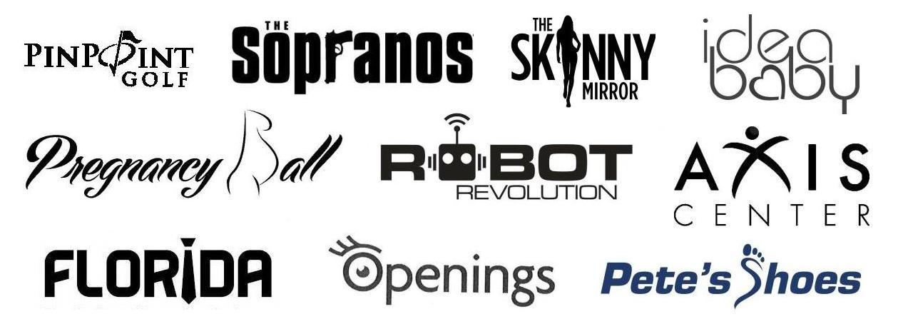
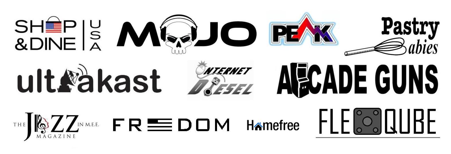
Last year, an Emblemetric analysis showed that logotype/symbol combinations were becoming increasingly popular relative to logotypes (wordmarks) or symbols alone. A prominent logo design trend among these logotype/symbol combination marks involves a wordmark in which one or more letters have been replaced with pictorial design elements. The resulting mark is neither symbol nor wordmark, but one that gives the appearance of having been cobbled together using disparate pieces, much as Frankenstein’s monster was assembled. These “frankenmarks,” if you will, have seen a resurgence in popularity over the last decade.

“Frankenmarks” as a percentage of all new US logos

frankenmarks1

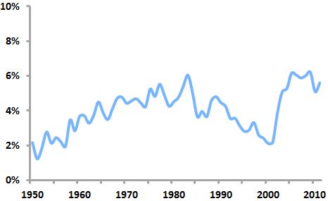
An analysis of United States Patent and Trademark Office data shows that frankenmarks first enjoyed a period of popularity in the 1970s and 80s, peaking in 1983, when 6.04 of all new US logos were frankenmarks. After declining in prominence in the 1990s, they surged  back into heavy use in the early 2000s. By 2009, they accounted for 6.21 percent of new US logos.

frankenmarks2

Among the design elements used most frequently in frankenmarks are stars (appearing in percent of 5.02 percent of frankenmarks), hearts (3.54%), and globes (2.83%), elements that are not only common symbols but that can easily stand in for commonly-used letters such as “o” and “a.” Design elements that appear in frankenmarks at a much higher rate than in logos as a whole include zippers (found in frankenmarks at a rate 4.34 times higher than in all logos), buttons (4.33 times higher), paper clips (4.18 times higher), and handcuffs (3.82 times higher).

frankenmarks3

How did the earlier period of frankenmark popularity (1975-1984) differ from the later period (2003-2011)? The particular design elements incorporated in frankenmarks changed somewhat. From 1975 to 1984, t-shirts were 5.54 times more likely to appear in frankenmarks than in the later period, while candy canes were 4.97 times more common and tridents were 3.13 times as prevalent.

frankenmarks4

From 2003 to 2011, magnifying glasses were 9.35 times more likely to appear in frankenmarks than they were in the earlier period, syringes were 4.42 times as likely, and bells were 41.5 times more common.

frankenmarks5

Interestingly, designers of contemporary frankenmarks seem to feel less need to have the pictorial elements of their logos correspond graphically to the letters they are replacing. This results in marks that a viewer reads by essentially “filling in the blanks” to account for the missing letters. While this is not typically a problem when the mark uses common words, legibility of less-well-known words or brand names may be threatened.

All in all, frankenmarks often seem to reflect a certain design amateurishness. Their designers’ attempts to combine wordmarks with symbols are frequently clumsy and overreaching, resulting in marks that can appear cheap and gimmicky. They rarely exude a sense of permanence and they don’t seem to last in use: indeed, of the logos filed between 2003 and 2011, 36.4 percent of the frankenmarks have “died,” compared to just 32.8 percent of the other logos. Those looking for a new logo should think carefully before adopting a frankenmark.

The State of Logos

Texaslogos

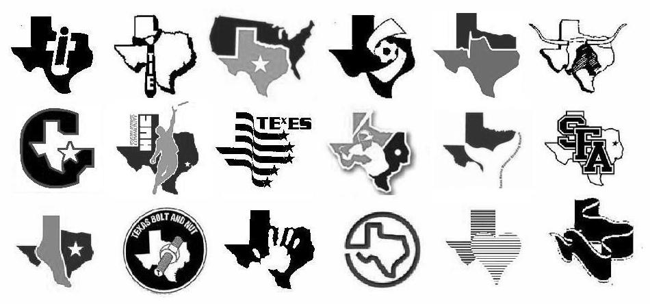
Texas “state shape” logos

James I. Bowie

The outlines of US states are often used as design elements in the nation’s logos. The shape of a state can be a meaningful symbol of identity for its residents.

quarters

US state quarter coins featuring state outlines

In the “50 State Quarters” program, which ran from 1999 to 2008, each US state was given the opportunity to be represented on the back of a US coin. Fifteen of the fifty states chose to include their state outlines as part of the coin design.

usmap

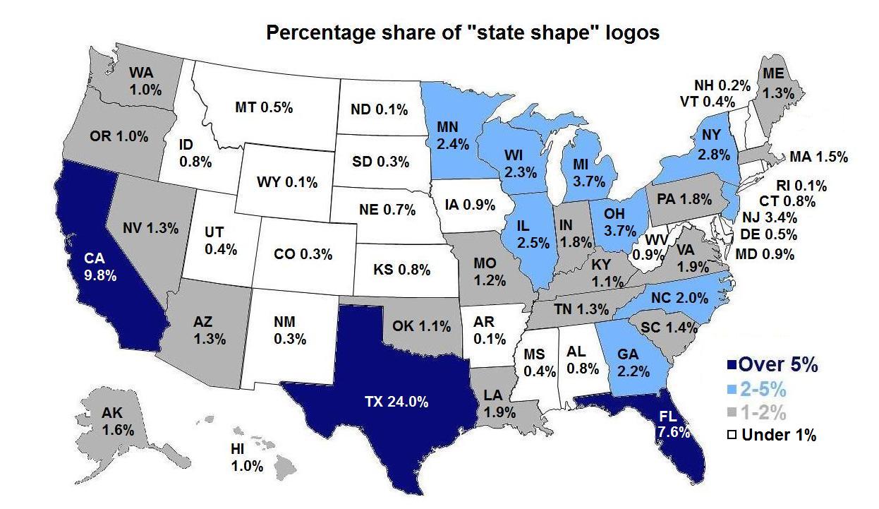
By examining United States Patent and Trademark Office data, we can see that the state of Texas features over twice as many “state shape” logos as its nearest competitor, California. Nearly one-quarter of all “state shape” logos depict Texas. This is not surprising, given the strong sense of state pride that Texans exhibit, the state’s large population and geographic size, and the fact that the state’s shape itself is distinctive, memorable, and relatively easy to use in a design context. 

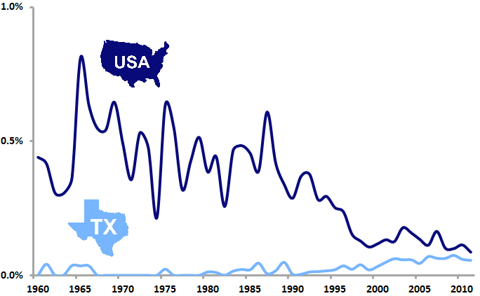
 Percentage of US logos featuring outlines of the nation and of the state of Texas

USATX2

By 2011, the percentage of new US logos featuring the shape of Texas (0.06%) had nearly equaled that of logos depicting the outline of the United States itself (0.09%), although this was due more to a decrease over time in the use of USA outline logos than to an increase in Texas state shape logos.

usmap2

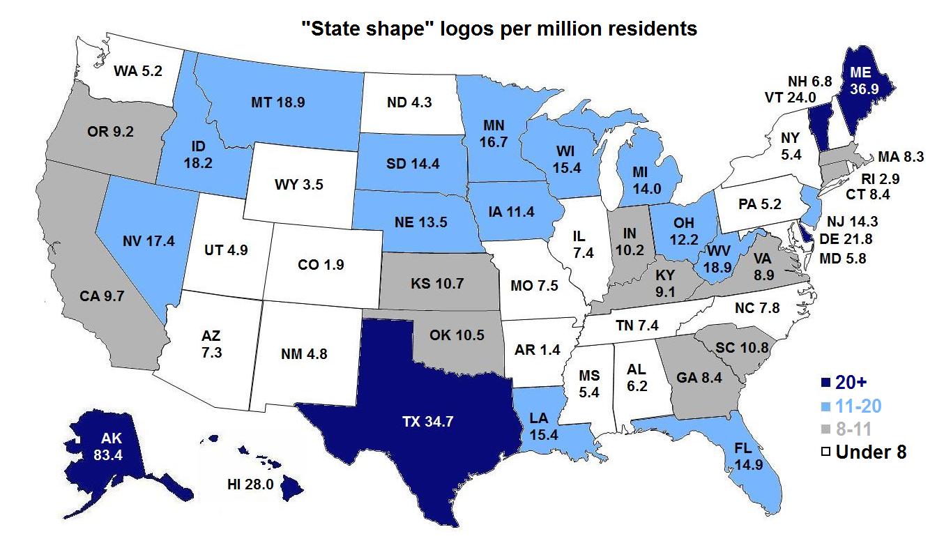
If we take the relative population of US states into account in our analysis, a slightly different picture emerges. The states of Alaska and Maine, each with much smaller populations than Texas, surpass it in terms of state shape logos per capita, perhaps putting a small dent in Texas pride.

Do you have a favorite logo that features the shape of a nation, state, province, or the like? Contact us and share it!

Logos Made in China

snake

James I. Bowie

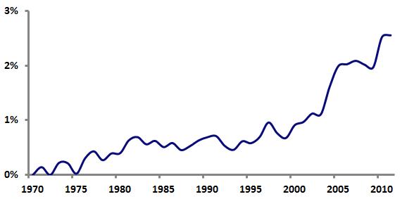
As China rings in the Year of the Snake, it’s a good time to look at the increasing prominence of the nation’s logos. The recent growth of the Chinese economy has brought with it a big jump in the number of trademarks that Chinese firms are filing in the United States. By 2011, Chinese companies accounted for 2.56 percent of the logos filed for trademark registration in the US.

Chinese logos filed for US trademark registration, as a percentage of all US logo filings

chinatm

Are there any logo design trends associated with this influx of Chinese marks? Analysis of United States Patent and Trademark Office data shows that, over the period from 2007 through 2011, certain design elements are much more likely to appear in logos from China than in non-Chinese logos.

Totally unsurprisingly, Chinese logos are 30.6 times more likely than other logos to contain inscriptions written with Asian characters.

china3

Similarly, Chinese logos are 7.35 times more likely to feature depictions of Asian men and 4.39 times more likely to include Asian women.

china4

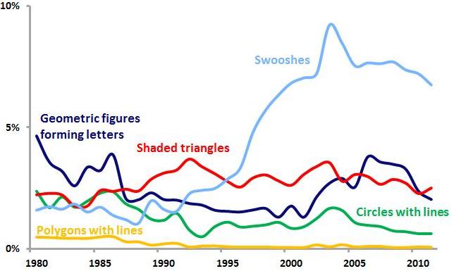
Polygonal shapes containing bars or lines seem to be a popular element in Chinese design; they are 3.99 times more likely to appear in logos from China. Notably, abstract marks in general are 1.64 times more common in Chinese logos.

china5

Pandas are 3.67 times more likely to appear in Chinese logos.

china6

Circles with bars or lines are featured in Chinese logos 2.50 times more often than in non-Chinese logos.

china7

Geometric figures forming letters are 1.99 times more likely to appear in Chinese logos.

china8

Shaded triangles are 1.77 times more common in Chinese logos.

china9

“Swooshes” appear in Chinese logos 1.52 times more than in other logos.

 Design elements as a percentage of all logos filed by US companies

chinatrends

The graph above shows the five abstract logo design trends popular within Chinese logos in terms of logos from American companies only. Swooshes, shaded triangles, and geometric figures forming letters have all enjoyed relatively recent popularity in US logos, suggesting that their prominence in Chinese logos may be due to logo trends spreading worldwide. But the relative paucity of US logos featuring circles with lines and polygons with lines indicates that these logo design trends may be more specific to China. Even in an increasingly globalized economy, it appears that there is still room for regional and national variation in logo design styles.

American Airlines’ New Logo, by the Numbers

Flight Symbol

James I. Bowie

FutureBrand’s redesign of Massimo Vignelli’s classic 1968 American Airlines logo and livery is the first big identity design news of the year. How does the new “Flight Symbol” relate to larger trends in U.S. logo design? Let’s investigate…

AA old logo

American’s 1968 logo

The most obvious change from the old American logo is the switch from a stylized depiction of an eagle in flight to an abstract version. By going abstract, FutureBrand has dealt with a couple of nagging problems related to using birds in airline logos.

flightsymbols

from Communication Arts, January 1963

The first is that airline bird logos have long been clichéd. Even a half-century ago, in 1963, a Communication Arts article detailed the work of designer Jim Cross in redesigning the identity of aerospace giant Northrop (now Northrop Grumman). Cross, noting the overabundance of birds in flight in aviation logos, did away with Northrop’s bird symbol and replaced it with a simple wordmark.

Secondly, airline bird logos reek of old-fashionedness. Discussing his work for United Airlines in a 1981 Los Angeles Times interview, the legendary Saul Bass noted, “Almost all airlines begin with a birdlike mark, but when we leap into jet technology, the safety factor becomes more important. You can’t go around with flapping birds any more.”

American’s new Flight Symbol is sufficiently abstract to mitigate these concerns.

Interestingly, it seems that had Vignelli had his way, American would have dropped its bird long ago. As he related to Bloomberg BusinessWeek, Vignelli did not want to include the traditional American eagle in the logo unless it was depicted fully realistically, so Henry Dreyfuss was enlisted by American to shoehorn an eagle into the design.

Some insight into the origin of the Dreyfuss eagle comes from a 1969 New York Times interview, in which Dreyfuss argues that “Designing a trademark is one of the most difficult things in the world. You have to become completely saturated in what you’re doing.” Reporter Philip Dougherty notes that Dreyfuss then “confided that American’s new mark was born on a paper napkin in the Plaza bar and one began to wonder just what kind of saturation he was talking about.”

In its abstraction, the new Flight Symbol is able to suggest elements beyond the flying eagle, such as a star and an “A” monogram. The design also incorporates a red-and-blue color scheme, the U.S. flag (on the plane’s tail), a single diagonal element, and it is abstract in general. Analysis of United States Patent and Trademark Office data allows us to assess the relative use of each of these design elements since 1968 among logos of all industries and those of the transportation industry in particular.

Percentage of new US logos featuring specific design elements

american

The associated avian design characteristics (eagles, birds in flight, wings) seem to be declining both in general and in transportation industry logos in particular. In order to preserve the visual heritage of its logo, American must employ design elements that imply a certain datedness. As noted above, however, the abstract nature of the Flight Symbol helps to allay these concerns. Other elements, such as stars and U.S. flags, have enjoyed somewhat more common use in recent years.

We may extend our analysis by looking at the “trendiness” of these design elements, which can be measured as a ratio of the share of each element among new logos from the last five years to the share of each element among “dying” logos over the same period. Using such a measure, values above 1 indicate design elements that are relatively “hotter,” while values below 1 suggest “colder” design elements.

“Trendiness” of design elements, 2007-2011

americantrendyAs the graph above shows, the “hottest” aspect of the design is the single diagonal, which is essentially the only new element added to the old Vignelli/Dreyfuss identity. This suggests that FutureBrand has done a good job of implementing a contemporary look that nicely augments and preserves American’s traditional identity, weighted down as it is with somewhat dated elements.