Logos Made in China

snake

James I. Bowie

As China rings in the Year of the Snake, it’s a good time to look at the increasing prominence of the nation’s logos. The recent growth of the Chinese economy has brought with it a big jump in the number of trademarks that Chinese firms are filing in the United States. By 2011, Chinese companies accounted for 2.56 percent of the logos filed for trademark registration in the US.

Chinese logos filed for US trademark registration, as a percentage of all US logo filings

chinatm

Are there any logo design trends associated with this influx of Chinese marks? Analysis of United States Patent and Trademark Office data shows that, over the period from 2007 through 2011, certain design elements are much more likely to appear in logos from China than in non-Chinese logos.

Totally unsurprisingly, Chinese logos are 30.6 times more likely than other logos to contain inscriptions written with Asian characters.

china3

Similarly, Chinese logos are 7.35 times more likely to feature depictions of Asian men and 4.39 times more likely to include Asian women.

china4

Polygonal shapes containing bars or lines seem to be a popular element in Chinese design; they are 3.99 times more likely to appear in logos from China. Notably, abstract marks in general are 1.64 times more common in Chinese logos.

china5

Pandas are 3.67 times more likely to appear in Chinese logos.

china6

Circles with bars or lines are featured in Chinese logos 2.50 times more often than in non-Chinese logos.

china7

Geometric figures forming letters are 1.99 times more likely to appear in Chinese logos.

china8

Shaded triangles are 1.77 times more common in Chinese logos.

china9

“Swooshes” appear in Chinese logos 1.52 times more than in other logos.

 Design elements as a percentage of all logos filed by US companies

chinatrends

The graph above shows the five abstract logo design trends popular within Chinese logos in terms of logos from American companies only. Swooshes, shaded triangles, and geometric figures forming letters have all enjoyed relatively recent popularity in US logos, suggesting that their prominence in Chinese logos may be due to logo trends spreading worldwide. But the relative paucity of US logos featuring circles with lines and polygons with lines indicates that these logo design trends may be more specific to China. Even in an increasingly globalized economy, it appears that there is still room for regional and national variation in logo design styles.

American Airlines’ New Logo, by the Numbers

Flight Symbol

James I. Bowie

FutureBrand’s redesign of Massimo Vignelli’s classic 1968 American Airlines logo and livery is the first big identity design news of the year. How does the new “Flight Symbol” relate to larger trends in U.S. logo design? Let’s investigate…

AA old logo

American’s 1968 logo

The most obvious change from the old American logo is the switch from a stylized depiction of an eagle in flight to an abstract version. By going abstract, FutureBrand has dealt with a couple of nagging problems related to using birds in airline logos.

flightsymbols

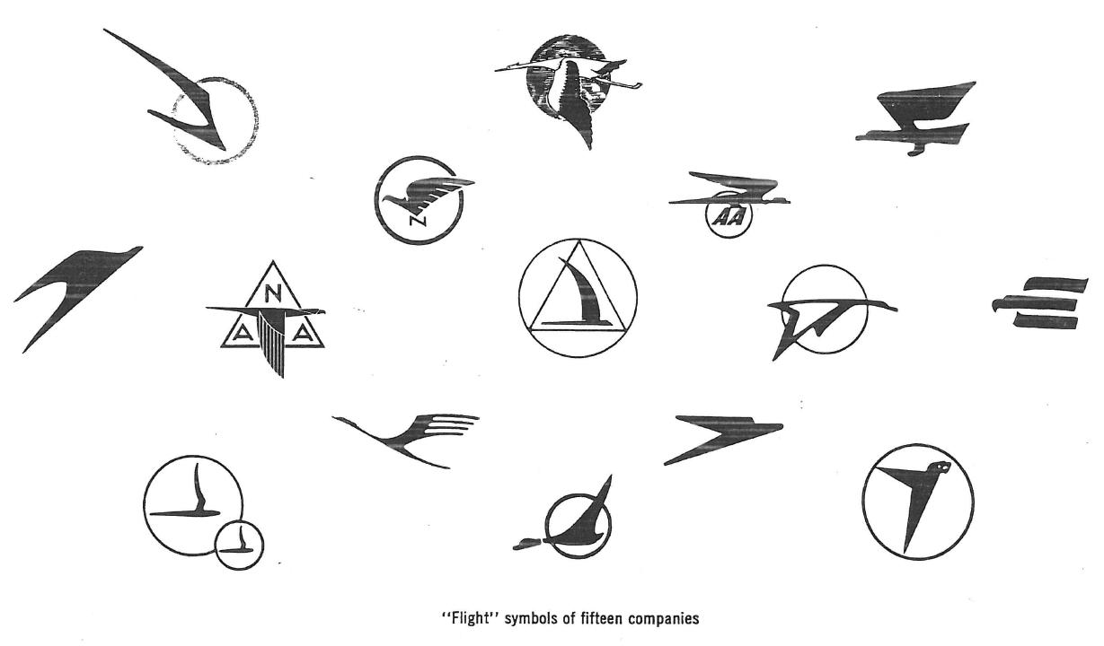
from Communication Arts, January 1963

The first is that airline bird logos have long been clichéd. Even a half-century ago, in 1963, a Communication Arts article detailed the work of designer Jim Cross in redesigning the identity of aerospace giant Northrop (now Northrop Grumman). Cross, noting the overabundance of birds in flight in aviation logos, did away with Northrop’s bird symbol and replaced it with a simple wordmark.

Secondly, airline bird logos reek of old-fashionedness. Discussing his work for United Airlines in a 1981 Los Angeles Times interview, the legendary Saul Bass noted, “Almost all airlines begin with a birdlike mark, but when we leap into jet technology, the safety factor becomes more important. You can’t go around with flapping birds any more.”

American’s new Flight Symbol is sufficiently abstract to mitigate these concerns.

Interestingly, it seems that had Vignelli had his way, American would have dropped its bird long ago. As he related to Bloomberg BusinessWeek, Vignelli did not want to include the traditional American eagle in the logo unless it was depicted fully realistically, so Henry Dreyfuss was enlisted by American to shoehorn an eagle into the design.

Some insight into the origin of the Dreyfuss eagle comes from a 1969 New York Times interview, in which Dreyfuss argues that “Designing a trademark is one of the most difficult things in the world. You have to become completely saturated in what you’re doing.” Reporter Philip Dougherty notes that Dreyfuss then “confided that American’s new mark was born on a paper napkin in the Plaza bar and one began to wonder just what kind of saturation he was talking about.”

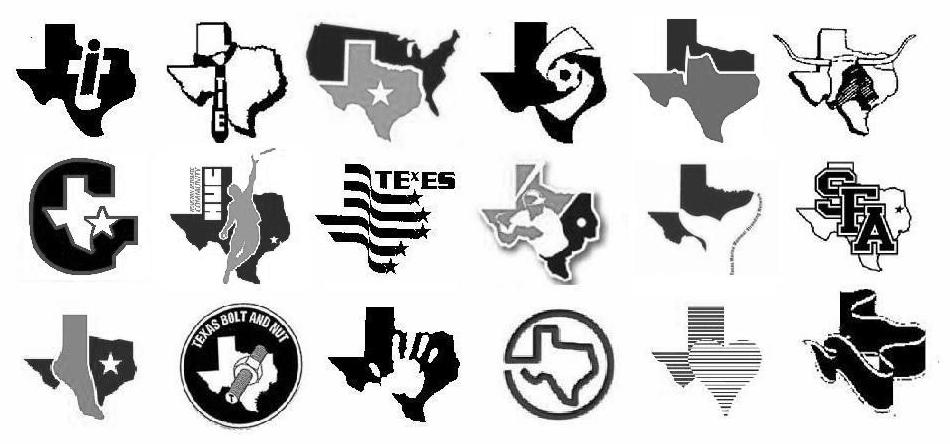
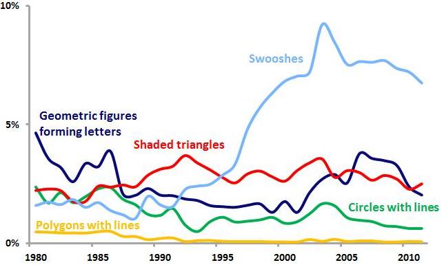
In its abstraction, the new Flight Symbol is able to suggest elements beyond the flying eagle, such as a star and an “A” monogram. The design also incorporates a red-and-blue color scheme, the U.S. flag (on the plane’s tail), a single diagonal element, and it is abstract in general. Analysis of United States Patent and Trademark Office data allows us to assess the relative use of each of these design elements since 1968 among logos of all industries and those of the transportation industry in particular.

Percentage of new US logos featuring specific design elements

american

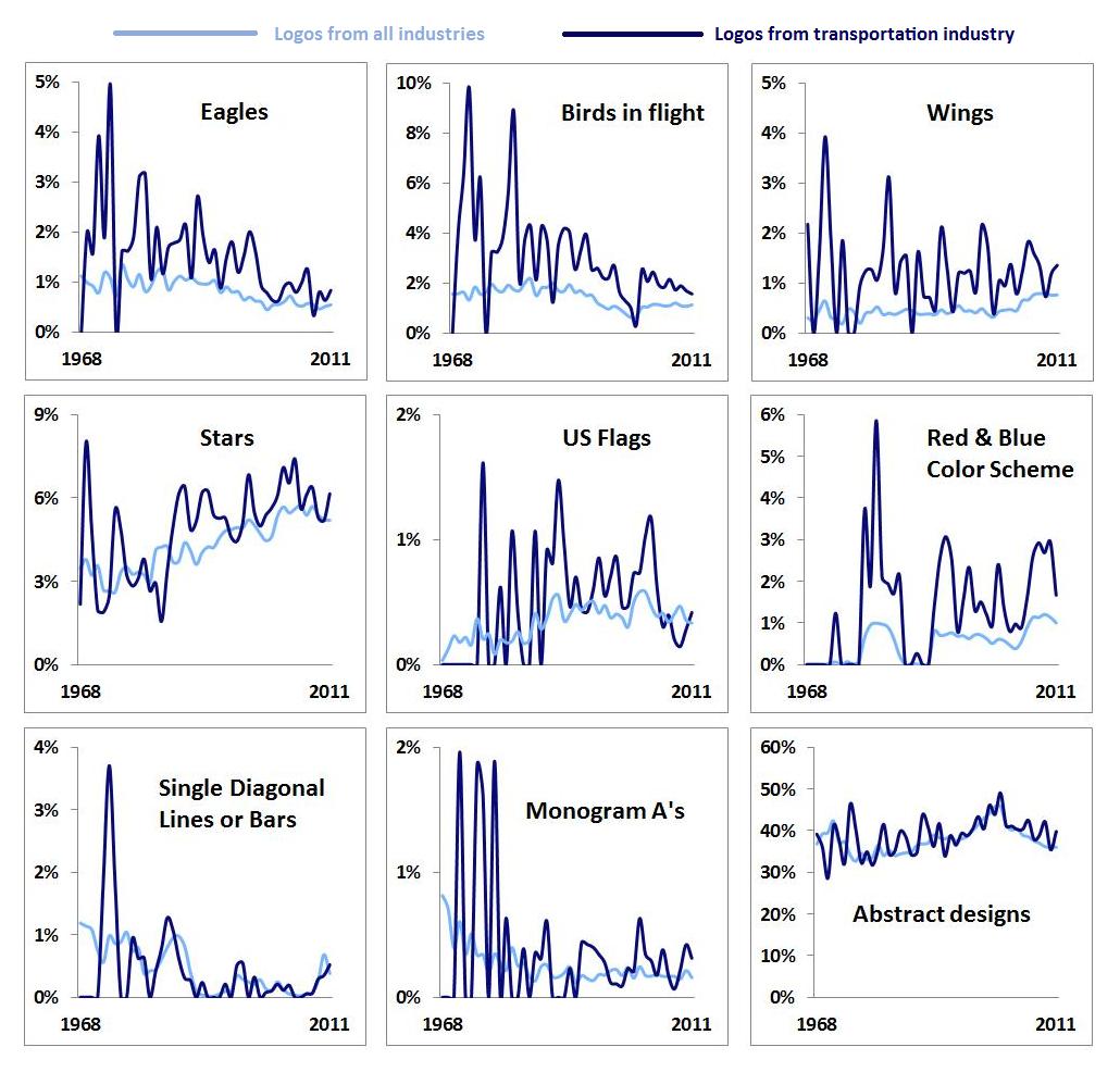
The associated avian design characteristics (eagles, birds in flight, wings) seem to be declining both in general and in transportation industry logos in particular. In order to preserve the visual heritage of its logo, American must employ design elements that imply a certain datedness. As noted above, however, the abstract nature of the Flight Symbol helps to allay these concerns. Other elements, such as stars and U.S. flags, have enjoyed somewhat more common use in recent years.

We may extend our analysis by looking at the “trendiness” of these design elements, which can be measured as a ratio of the share of each element among new logos from the last five years to the share of each element among “dying” logos over the same period. Using such a measure, values above 1 indicate design elements that are relatively “hotter,” while values below 1 suggest “colder” design elements.

“Trendiness” of design elements, 2007-2011

americantrendy
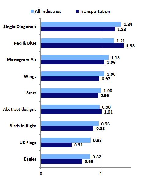
As the graph above shows, the “hottest” aspect of the design is the single diagonal, which is essentially the only new element added to the old Vignelli/Dreyfuss identity. This suggests that FutureBrand has done a good job of implementing a contemporary look that nicely augments and preserves American’s traditional identity, weighted down as it is with somewhat dated elements.

By Their Stripes You Shall Know Them

James I. Bowie

2012 marked the 40th anniversary of Paul Rand’s 8-stripe IBM logo (top left) and, according to some chronologies, the 45th anniversary of the less-used 13-stripe version (top right). These marks launched a thousand imitators and defined the look of high-technology logos for years. But before they could do so, they were subject to the same sort of armchair design criticism that today’s social media have made so common. As Rand recounted in a 1991 article, his pitch to add stripes to the IBM mark he had previously designed prompted one IBM executive to snort, “It reminds me of the Georgia chain gang.” A prison uniform may have been the most obvious visual referent for stripes at the time, but the IBM logo quickly changed that.

1980sstripedlogos

Striped 1970s and 80s logos from John Mendenhall’s “High Tech Trademarks”

As the computer industry and related high-tech fields took off in the 1970s and 80s, they spawned companies that looked to Big Blue for inspiration when adopting logos. John Mendenhall’s excellent 1985 book, High Tech Trademarks, displayed dozens of examples of these striped marks. Moving beyond the IBM comparisons, Mendenhall saw in them the imagery of the integrated circuit: “This intricate circuitry with its intriguing pattern of lines, often tapering from thick to thin, is the physical embodiment of unseen power.  It is appropriate then that these linear compositions, seemingly random yet actually highly structured, have become the visual metaphor for an entire industry.”

Percentage of new US logos featuring stripes, by industry

stripeindustry

Analysis of United States Patent and Trademark office data shows that use of stripes in logo designs peaked in 1986, when 9.9 percent of all new logos and 22.4 percent of new computer-related logos featured stripes. But the trend quickly died off amid criticism of the glut of lookalike marks, as stripes went from being seen as technical, precise, and advanced to simply cold, impersonal, and anonymous. By 2011, only 1.8 percent of new logos and 1.9 percent of new computer logos were striped.

Striped logos as a percentage of all new US logos, 2002-2011, in select industries

stripeindustry2

Where are striped logos to be found today? The graph above shows the prevalence of new striped logos within selected industries over the last ten years. Decidedly lower-tech industries such as machines, metals, and vehicles, perhaps late to the striped-logo party, are more likely to use stripes than their high-tech counterparts.

Logos Get Real

James I. Bowie

Perhaps the most significant development in twentieth-century logo design was the rise of the abstract logo. In the United States, the burgeoning corporate identity field helped spread modernist German and Swiss design philosophies, resulting in many pictorial logos being replaced by clean, stark, abstract marks. Such logos were particularly favored by expanding American corporations whose business activities, as they became more varied and technologically complex, could no longer be depicted in a simple, realistic trademark.

Abstract logos faced a strong backlash from Americans accustomed to more realistic symbols. A 1966 Printers’ Ink cover story asked whether these new trademarks were “Imagery or Tomfoolery?” In 1972, Tom Wolfe called abstract logos “the creamiest piece of pie-in-the-sky that American graphic arts have ever sold to American business” and said that they “make absolutely no impact…except insofar as they create a feeling of vagueness or confusion.” Karrie Jacobs in 1987 noted that “Logos, then, evolve backward with complex, multifaceted trademarks down in the primordial muck and geometric marks of amoebalike plainness up at the top of the ladder.”

Abstract and realistic logos as a percentage of all new US logos

Analysis of United States Patent and Trademark Office data shows that the use of abstract logos peaked twice in the last half-century, although abstract logos have never been more common than realistic marks. In 1971, 42.3 percent of new U.S. logos were abstract, but that figure dropped over the next several decades.

By the mid-1990’s, abstract logos began a comeback that culminated in 2001, when 45.8 percent of new logos were abstract. This spike was almost certainly driven by the late-90’s dot-com boom and the wave of abstract swooshes that accompanied it. Look for Emblemetric to examine this trend in a future article.

The last decade has seen a significant drop in the use of abstract logos, with a corresponding increase in realistic symbols. In 2011, 36.0 percent of new logos were abstract, while 61.8 percent were realistic.

Industries with high rates of abstract logo use

 Industries with high rates of realistic logo use

The graphs above show that, not surprisingly, abstract logos are more common in high-technology industries and those where the product or service cannot be easily depicted, while realistic logos are more prevalent in industries where the product has been long established and its consumption occurs on a personal level.

Overall, whether a logo is realistic or abstract seems to have little effect on whether it survives or “dies” over time. Of the realistic logos created since 1960, 34.8 percent are still in use as trademarks, compared to 35.6 percent of abstract logos.

Logo ABC’s

James I. Bowie

The single-letter monogram is a basic and classic form of logo that still enjoys wide use today. Looking back through United States Patent and Trademark Office data, we can see that the use of such monograms peaked in the US in 1970, when they made up 6.7 percent of new logos. By 2011, just 2.4 percent of new logos were single-letter monograms.

Single-letter monograms as a percentage of all new US logos

Further analysis reveals which letters are most popular for use in single-letter monogram logos. By comparing the prevalence of particular letters in monograms relative to their use as the initial letters in all trademarked words and phrases, we can see which letters are disproportionately used as monogram logos. For instance, “M” is the first letter in 6.3 percent of all trademarked words, but is used in 9.4 percent of single-letter monogram logos. This gap of 3.1 percent is the highest for any letter, indicating that “M” is most favored for use in monograms. The table below shows these figures for all letters.

Percentage difference between use of letters in monograms and use of letters to begin all trademarked words and phrases

M   3.1%
V   2.0%
A   1.7%
X   1.4%
K   1.4%
W   1.4%
Z   1.2%
H   1.1%
Q   1.0%
E   1.0%
G   0.8%
R   0.5%
Y   0.2%
N   0.2%
U   0.1%
J   -0.3%
I   -0.5%
D  -0.8%
O   -0.8%
B   -0.9%
S   -1.2%
F   -1.3%
L   -1.8%
P   -2.2%
C   -2.6%
T   -4.5%

Interestingly, the four most popular letters for monograms (M, V, A, and X) are vertically symmetrical, while six of the seven least-popular letters are vertically asymmetrical.

Which letters are currently “trendy” for use in single-letter monograms? We can answer this question by analyzing data from the past five years related to new trademarks and “dying” trademarks. The table below shows the ratio of the share of each letter’s use in new monograms over the last five years to the share of each letter’s use in dying monograms over that period. So if a letter appears in 10 percent of new monograms and 10 percent of dying monograms, its ratio is 1, meaning that it is not at all trendy in a positive or negative way. However, if a letter appeared in 40 percent of new monograms and just 20 percent of dying monograms, its ratio would be 2, meaning that it would be very “hot.” Likewise, if a letter were used just 10 percent of the time in new monograms and 30 percent of the time in dying monograms, its ratio would be 0.33, making it quite “cold.”

“Trendiness” of letters in single-letter monograms, 2007-11

O   1.43
V   1.36
U   1.26
E   1.23
B   1.20
W   1.20
G   1.19
F   1.09
T   1.05
R   1.04
K   1.03
A   1.03
Z   1.01
Q   0.97
I   0.97
S   0.95
H   0.95
Y   0.94
L   0.94
P   0.91
J   0.90
M   0.89
N   0.80
X   0.78
C   0.75
D   0.66

“O” leads the way here, perhaps in part due to the popularity and success of the Obama campaign’s “O” monogram, while old standbys “M” and “X” seem to be losing steam.

Single-letter monograms, although their greatest popularity appears to be behind them, remain a viable option for logos. The suggestion here is that formal characteristics of letters themselves, particularly vertical symmetry, may impact which letters are more likely to be turned into monograms.

Everyone Gets a Ribbon

James I. Bowie

October is Breast Cancer Awareness Month in the United States, and the associated pink ribbons are everywhere. Over the last several decades, such “cause ribbons” designed to raise awareness of various issues have become extremely common visual symbols. The graph below shows the recent sharp increase in the use of ribbons in US logos.

“Ribbon” logos as a percentage of all new US logos

The popularity of the ribbon symbol took off in the United States in 1979, when yellow ribbons were tied around trees in support of the American embassy personnel held hostage in Iran. This practice was inspired by the song “Tie A Yellow Ribbon ‘Round the Ole Oak Tree,” which had been a hit for Tony Orlando and Dawn in 1973. The song was based on an American folk tale of a man returning to his hometown after serving a prison sentence. He had written a letter to his old girlfriend asking her to tie a yellow ribbon around an oak tree if she still loved him; as his bus pulls up he sees “a hundred yellow ribbons ’round the old oak tree.”

MADD door handle ribbon, Red Ribbon Drug-Free Youth mark, Arthur Ashe looped ribbon with tennis ball logo

The use of cause ribbons began to spread in the 1980s and 1990s, as yellow ribbons took on a meaning of “supporting the troops” and red ribbons were used in the anti-AIDS movement. In 1989, a cause ribbon first appeared in a registered US trademark, a symbol of MADD (Mothers Against Drunk Driving) depicting a red ribbon tied around a car door handle. In 1990, the National Federation of Parents for Drug Free Youth used a red ribbon logo, and in 1993, the now-familiar looped ribbon first appeared in another red ribbon mark used by Arthur Ashe’s organization in its fight against AIDS.

While ribbons had traditionally been used in logos to depict gifts (as in Paul Rand’s original UPS logo), awards (Pabst Blue Ribbon), or as banners for text, cause ribbons quickly assumed a prominent place in logos. By 2011, 21 percent of logos containing a ribbon of any sort featured a cause ribbon.

The looped ribbon symbol ultimately became so popular that the United States Patent and Trademark Office came to consider it a “universal symbol,” like the Christian cross or the peace symbol, meaning that it cannot be registered as a trademark without being graphically modified in a distinctive way.

Color is obviously an important aspect of cause ribbons, as different colors signify various causes. The graph above shows that as cause ribbons have proliferated, the variety of colors used in ribbon logos has exploded. While 95 percent of ribbon logos featuring colors between 1980 and 1999 used either red or blue, since 2000 other colors have seen dramatic increases in use. Most notable among these is pink, which has become nearly as popular as red and blue in ribbon logos, a testament to the success of the breast cancer awareness movement.