Dying leaves?

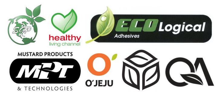
“Leaf” logos filed for trademark registration in 2011

James I. Bowie

One of the most prominent trends in logo design in recent years has been the proliferation of leaves as design elements.  As companies have attempted to adopt images that reflect our society’s increasing concern for the environment, the leaf has become visual shorthand for eco-friendliness.

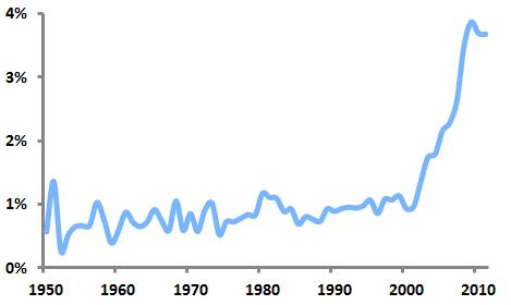
Percentage of new logos containing leaves

The graph above shows the sudden jump in leafy logos over the past decade (the analyses here are concerned only with logos containing generic leaf images; logos featuring specific leaves such as maple, oak, and holly are not included). By 2009, the percentage of logos with leaves reached 3.87 percent, before dropping off slightly in 2010 and 2011. It may be that we have seen this trend peak.

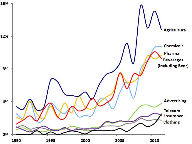
 Leaf logos by industry

Of course, the leaf logo trend has not taken hold equally across all industries. The graph above shows that logos in industries such as agriculture, chemicals, and pharmaceuticals are much more likely to feature leaves: for example, in 2008, almost 16 percent of all new agricultural logos contained leaves. But even those industries such as insurance and advertising that would seem to have little use for natural or “green” images have seen marked increases in leafy logos.

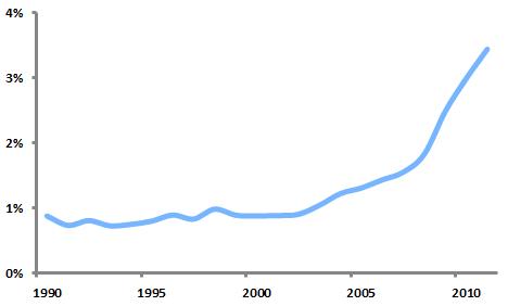
Percentage of “dying” logos containing leaves

The flipside of the leaf’s popularity as a design element is that more and more “dying” trademarks (those that are abandoned, canceled, or expired) contain leaves. The graph above shows this increase. By 2011, 3.44 percent of dying logos contained leaves, nearly matching the percentage of new 2011 logos with leaves (3.68%). It appears that the leaf is transitioning from logo design trend to logo design cliché.

Logotype vs. Symbol

James I. Bowie

A common question in branding and identity design concerns the relative effectiveness of logotypes (stylized typographic expressions of a company or brand name) and symbols (graphic icons that represent a company or brand).

Those from a marketing background often pooh-pooh graphic symbols and recommend the use of logotypes, which promote a name above all else. Jack Trout, writing for Forbes in 2007, declared:

“Logos have been with us for thousands of years…The Roman legions had them. In the middle ages, every two-bit duke with a handful of knights had one plastered on their shields. There were crests or coats of arms everywhere. But none ever amounted to anything. What lived on were the names of the people involved or the places the big battles were fought. What does that tell you? It’s not about the symbol. It’s about the name connected to the symbol.”

Designers, not surprisingly, have more appreciation for the power of symbols relative to logotypes. In a 1999 Communication Arts article, Mark Fox discussed Nike’s decision to detach its Swoosh symbol from its logotype:

“After the connection between a company and logo…is sufficiently understood by the public, the power of the logo can, on occasion, be increased by dropping the company name. Beyond making the symbol translingual, the lack of text can allow the logo to possess a certain ineffable quality that suggests far more than it could before. The ancient Hebrews realized this and, as a result, had a proscription against writing the name of God. That which is named is always less powerful than that which is unnamed.”

Analysis of United States Patent and Trademark Office data can shed some light on the relative use and success of symbols and logotypes.

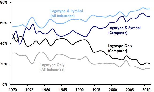
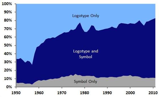
Relative Use of Graphic Trademark Types

The graph above shows that, over the last five decades, the most common type of graphic trademark filed for registration in the US has moved from the logotype alone to the combination of logotype and symbol. The prevalence of the unaccompanied symbol has risen slightly, but it remains the least common of the three options (of course, many companies will register multiple versions of their trademarks, featuring logotype, symbol, or both).

“Trendiness” of Graphic Trademark Types

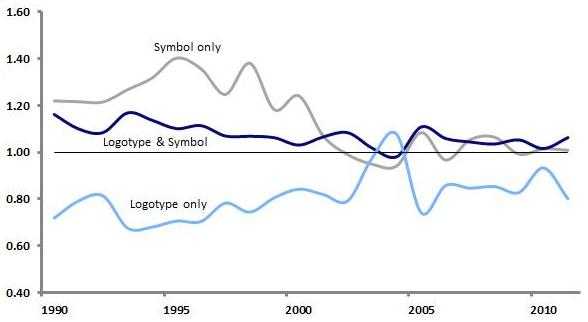
By factoring in the types of trademarks that are “dying” (being abandoned or canceled, or expiring) in a given year, we can get a sense for how “trendy” each of these types has been.

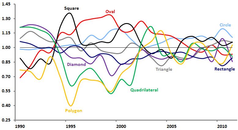
The above graph’s vertical axis represents a ratio of the share of graphic trademark type in new logos in a given year to the share of graphic trademark type in dying logos from that year. So if symbols account for 20 percent of new trademarks in a year and 20 percent of dying trademarks in that year, their ratio is 1, meaning that they are not at all trendy in a positive or negative way. However, if logotypes made up 80 percent of new trademarks and just 40 percent of dying trademarks, their ratio would be 2, meaning that they would be very “hot” for that year. Likewise, if combinations of logotypes and symbols were used just 20 percent of the time in new trademarks and 60 percent of the time in dying trademarks, their ratio would be 0.33, making them quite “cold.”

We can see that for much of the past two decades, symbols were “hot” while logotypes were “cold.” Only in the past few years has the logotype/symbol combination become hotter than symbols alone, while logotypes alone continue to seem to be dying out at a faster rate than they are being created.

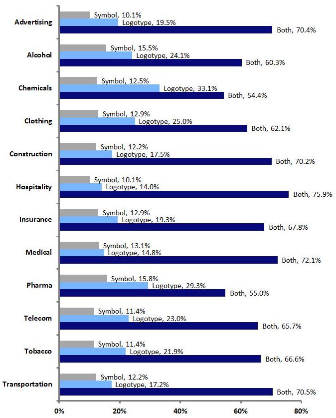
Graphic Trademark Type by Industry

Looking at selected industries, we can see that symbols alone are used most often in pharmaceutical and alcohol trademarks, and least often in advertising and hospitality. Logotypes alone are used most in chemical and pharmaceutical marks, and least often in hospitality and medical marks. Combinations of logotypes and symbols are used most often in the hospitality and medical industries, and least often in chemical and pharmaceutical trademarks.

Another way to assess the relative success of the different types of graphic trademarks is to look at how long they survive in use, from the time they are filed for registration until they are abandoned, canceled, or expired.

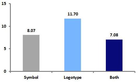
Lifespan, in years, of graphic trademark types

The graph above shows that, among trademarks that have died, those using logotypes alone had the longest average lifespan (11.7 years, followed by symbols alone (8.07 years) and the logotype/symbol combination (7.08 years). While a trademark’s survival over time does not necessarily mean that it is an effective mark, such longevity should be seen as a positive thing in general.

The Color of Logos

James I. Bowie

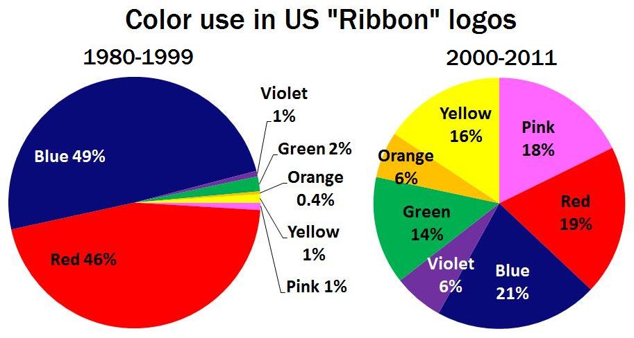
Color has become an even more important aspect of logo design in today’s web-based world. How has color been used in US logo design over the past several decades? Analysis of United States Patent and Trademark Office data can provide some answers.

Use of Color in US Logos

The graph above shows the relative share of color use in US logos over the last two decades (logos that did not contain these colors, or that did not feature color at all, were omitted from the analysis). The vertical axis indicates the percentage of logos filed for trademark registration in a given year that contained each color; these percentages add up to 100 percent for each year.

A few trends stand out here. Red, which was by far the most popular color used in logos in the 1990’s, has been caught by blue; they now are used about equally. Green has seen a modest rise in use, most likely due to increased environmental consciousness in American society. And orange has enjoyed a slight increase in popularity.

“Trendiness” of Color Use in US Logos

Another way to address this issue is to analyze the colors used not just in new logos, but in logos that have “died” (i.e., trademarks that have been abandoned, canceled, or expired). The graph above provides a measure of trendiness by combining color data from new logos with color data from dying logos.

The graph’s vertical axis represents a ratio of the share of color use in new logos in a given year to the share of color use in dying logos from that year. So if red accounts for 20 percent of the use of color in new logos in a year and 20 percent of the use of color in dying logos in that year, its ratio is 1, meaning that it is not at all trendy in a positive or negative way. However, if blue were used 80 percent of the time in new logos and just 40 percent of the time in dying logos, its ratio would be 2, meaning that it would be a very “hot” color for that year. Likewise, if green were used just 20 percent of the time in new logos and 60 percent of the time in dying logos, its ratio would be 0.33, making it quite “cold.”

With this in mind, we can see that violet was a trendy color in US logos for much of the 1990’s, before cooling off in the last decade. Orange, brown, and green have been hot in recent years, while red has languished somewhat. Over the last three years, the lines on the graph converge around the middle, suggesting that no color is particularly hot or cold.

Use of Color in US Logos by Industry

Color use in logos can also be addressed in terms of particular industries. The graph above shows the relative use across time of eight colors in the logos of seven selected industries (again, these shares sum to 100 percent).

While there are not drastic differences in color use across these industries, some results are notable. Red is used most often in the logos of the beverage and hospitality industries, and least often in insurance and medical services. Blue is used most in telecom and insurance, and least in hospitality marks. Green appears most often in chemicals and least often in telecommunications.

Logo Geography

James I. Bowie

Are there geographical aspects to logo design? In other words, do logos differ based on  the location of the companies and organizations they represent? An examination of United States Patent and Trademark Office data may provide some insight.

Share of US Logo Trademark Ownership, by Region (1884-2011)

In the graph above, we can see that companies in the western US have claimed the largest share of US logos, while 18 percent of logos registered in the US have foreign owners. Broken down by state, California (14.4%) is home to the most logos, followed by New York (8.8%), Florida (5.2%), and Texas (5.1%).

Share of US Logo Trademark Ownership, by Region

Looking at the data over time, it appears that, since 1960, the East and Midwest have lost ground in terms of their share of the nation’s logos, while the West and South have seen gains. This is not surprising, given the shifts in the US population over this period.

Further examination of the data allows for identification of content-related design trends among the logos of the different geographical regions. The following results are based on analysis of logos filed for registration over the past ten years.

East

Logos of Eastern companies and organizations feature the following graphic elements at significantly higher rates than are seen in US logos as a whole:

  • Basketballs: 107 percent higher than average
  • Pills: 77 percent higher
  • Open books: 48 percent higher
  • Mythological beings/superheroes: 45 percent higher
  • Dogs: 30 percent higher
Eastern logos are also the most likely to contain male figures.

 West

Logos of Western companies and organizations feature the following graphic elements at significantly higher rates than are seen in US logos as a whole:

  • Marijuana plants: 151 percent higher than average
  • Surfboards/snowboards: 123 percent higher
  • Mountains: 65 percent higher
  • Cacti: 61 percent higher
  • Skeletons/skulls: 57 percent higher
  • Peace symbols: 47 percent higher
Western logos are also the most likely to contain female figures.

Midwest

Logos of Midwestern companies and organizations feature the following graphic elements at significantly higher rates than are seen in US logos as a whole:

  • Corn stalks: 154 percent higher than average
  • Pizza: 116 percent higher (Domino’s and Little Caesars are based in Michigan)
  • Trucks/vans: 85 percent higher
  • Baseball bats: 76 percent higher than average
  • Cylinders: 69 percent higher (probably due to their use in logos related to manufacturing)
  • Rabbits: 67 percent higher (Playboy is headquartered in Chicago)

South

Logos of Southern companies and organizations feature the following graphic elements at significantly higher rates than are seen in US logos as a whole:

  • Tobacco leaves: 121 percent higher than average
  • Alligators: 69 percent higher
  • States of the US (not including Texas): 67 percent higher
  • Crosses: 57 percent higher
  • Fishing tackle: 55 percent higher
  • American flags: 36 percent higher
Southern logos are also the most likely to contain representational (as opposed to abstract) and natural design elements, as well as the most likely to exhibit character or personality.

Foreign

Logos of Foreign-owned companies and organizations feature the following graphic elements at significantly higher rates than are seen in US logos as a whole:

  • Alcohol bottle labels: 177 percent higher than average
  • Heraldic lions: 72 percent higher
  • Dragons/griffons: 40 percent higher
  • Three or more ovals: 39 percent higher
  • Coffee beans: 33 percent higher
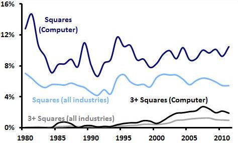
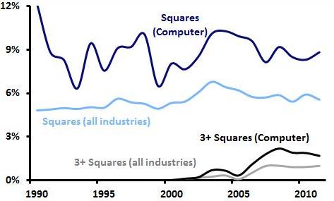
  • Squares that are completely or partially shaded (such as the Orange mark): 19 percent higher

Foreign logos are also the most likely to contain abstract, artificial, and curved design elements.

In general, these geographic characteristics of logos are interesting, but, for the most part, not too surprising. However, some seem to cry out for explanations that are not immediately obvious. Why do Eastern logos feature so many dogs? What explains the popularity of abstract elements such as ovals and shaded squares among non-US companies? Perhaps further research may offer some answers. Do you have a theory? Contact us and share it!

Seeing Stars

2011 logos featuring two stars in a circular border

James I. Bowie

The use of two stars as a design element in US logos increased by 170 percent in 2011 over the preceding five-year period. Looking back over time, we can see that, following a pronounced dip in the 1970’s, logos with two stars have been claiming an increasing share of new trademark filings for the last three decades.

Logos with two stars, as a percentage of all logos

What explains this rise? Looking through US trademark registration images, it appears that many of the “two-star” logos employ a similar graphic device: the two stars are used as markers or dividers within a logo’s circular border containing text. Analysis of US trademark data shows that the percentage of “two-star” logos that include a circular border element has increased sharply in recent years.

Logos with two stars in a circle, as a percentage of all logos with two stars

Consequently, logos with two stars in a circle have become more prevalent in general, with particular increases occurring in the 1990’s and 2000’s. 

Logos with two stars in a circle, as a percentage of all logos

Of course, this graphic convention is nothing new; for instance, university seals have been employing it for decades:

But the recent popularity of this visual device may be attributable to perhaps the best-known logo to use it: that of Starbucks. The coffee chain first used the two stars in 1987 and retained them in its 1992 logo (below). It’s not a stretch to attribute the rise of this logo design trend over the last couple of decades to the ubiquitous Starbucks siren.

The Starbucks connection makes more sense when this logo design trend is examined in terms of the industries associated with the marks. Aside from the relatively small industry categories of firearms and yarns, the “two stars in a circle” design element appears most frequently in the logos of the hospitality industry (restaurants, bars, and hotels). Of course, in 2011 Starbucks famously dropped the circle and stars from its logo, so it would not be surprising to see this trend lose steam soon.

The Lucent Logo Legacy