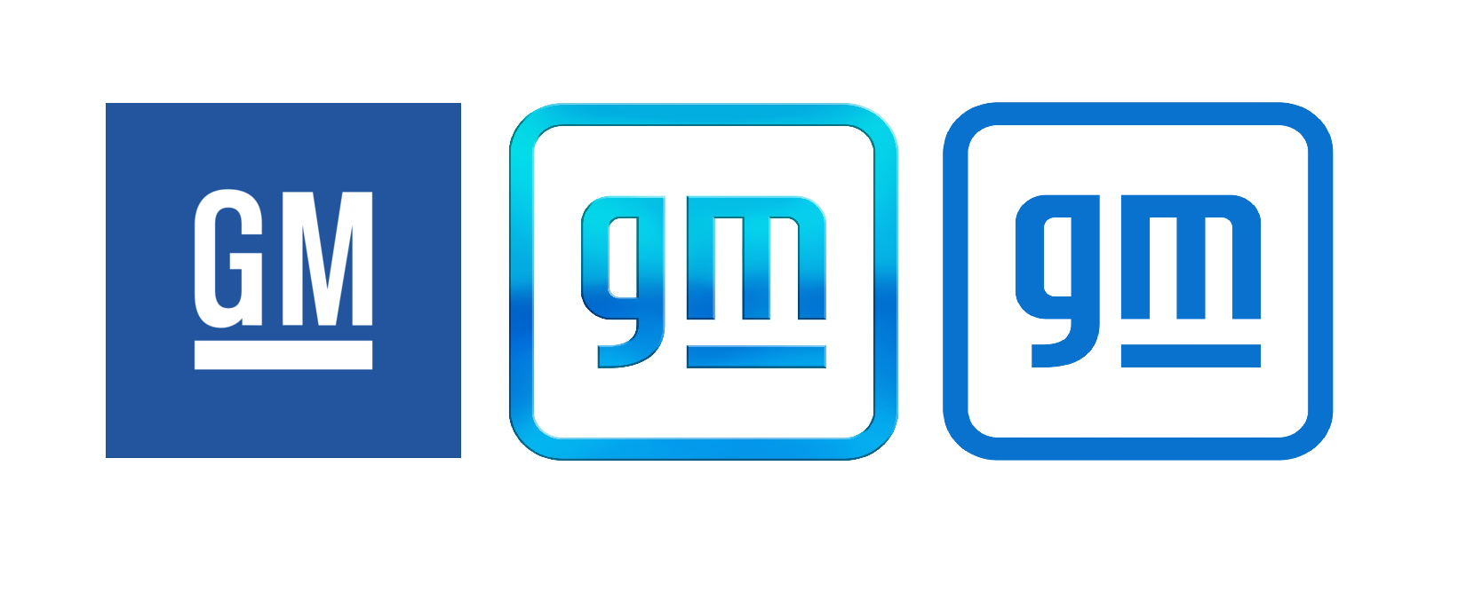
Emblemetric’s James I. Bowie on the new GM logo in Marker, Medium’s business publication:

Emblemetric’s James I. Bowie on the new GM logo in Marker, Medium’s business publication:

Emblemetric’s James I. Bowie writes about Supreme and its multibillion-dollar logo for Marker, Medium’s business publication:
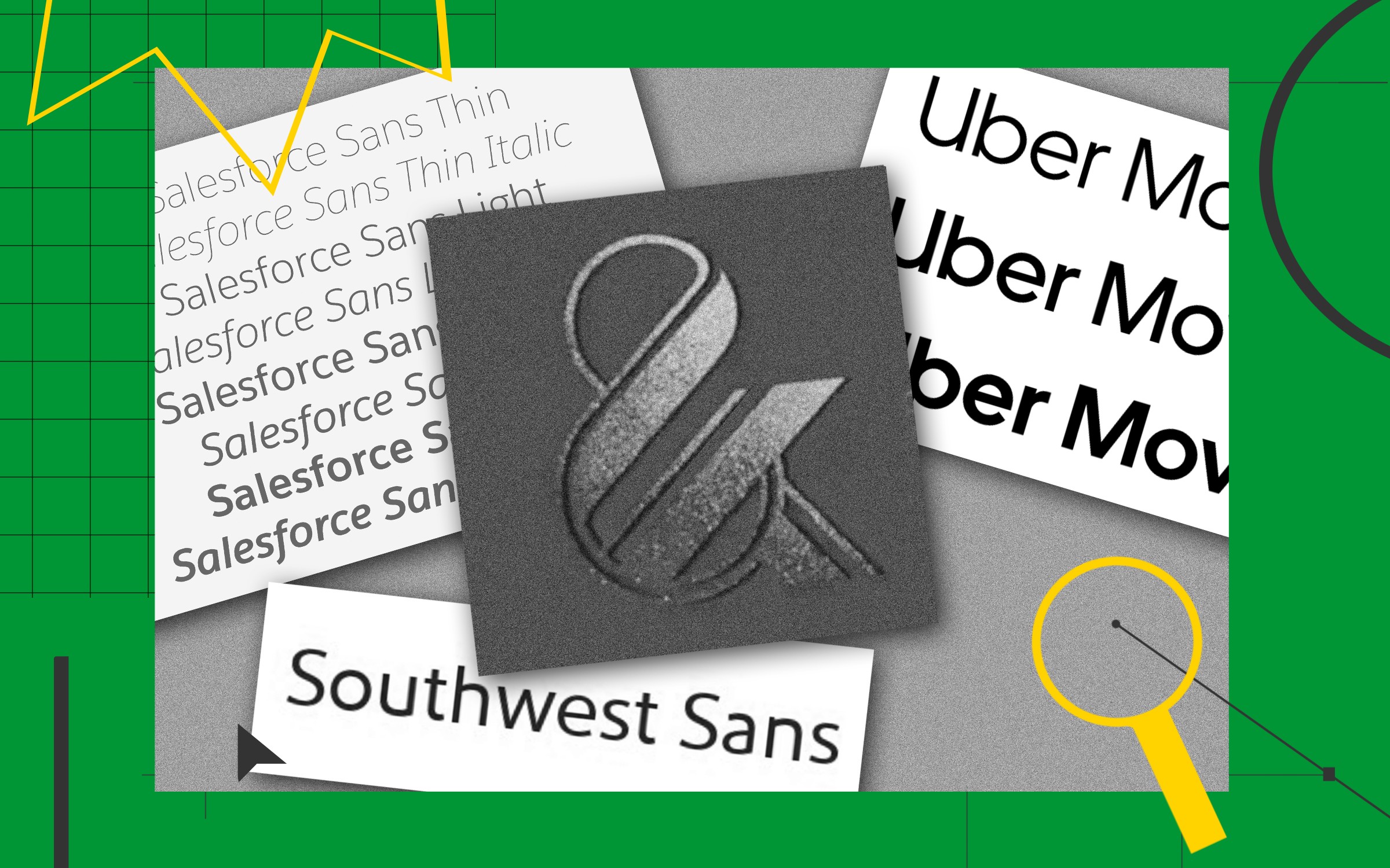
Emblemetric’s James I. Bowie writes about the phenomenon of bespoke typefaces for Marker, Medium’s business publication:
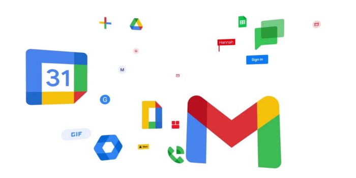
Emblemetric’s James I. Bowie writes about the Google Workspace rebrand, including the demise of the Gmail envelope, for Marker, Medium’s business publication:
Those New G-Suite Logos Everyone Hates? They’re Actually a Smart Idea
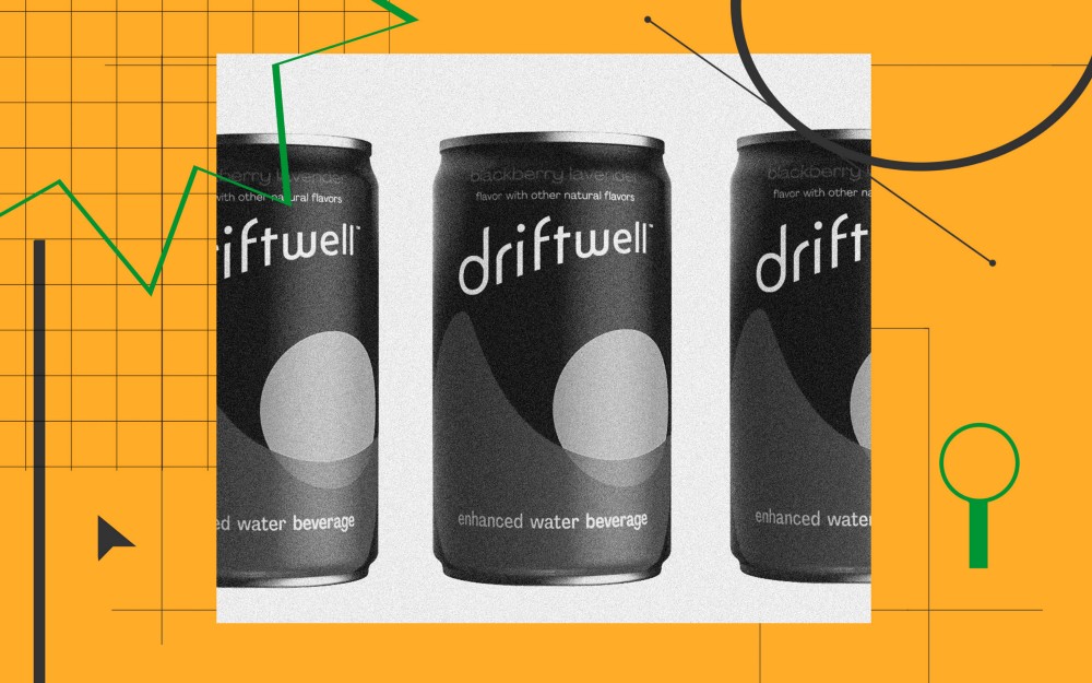
Emblemetric’s James I. Bowie writes about the branding of Driftwell, Pepsi’s new “enhanced water beverage,” for Marker, Medium’s business publication:
How Pepsi Got Suckered Into Every Hot Branding Trend

For Marker magazine, Emblemetric’s James I. Bowie has written about Spotify’s underwhelming branding: