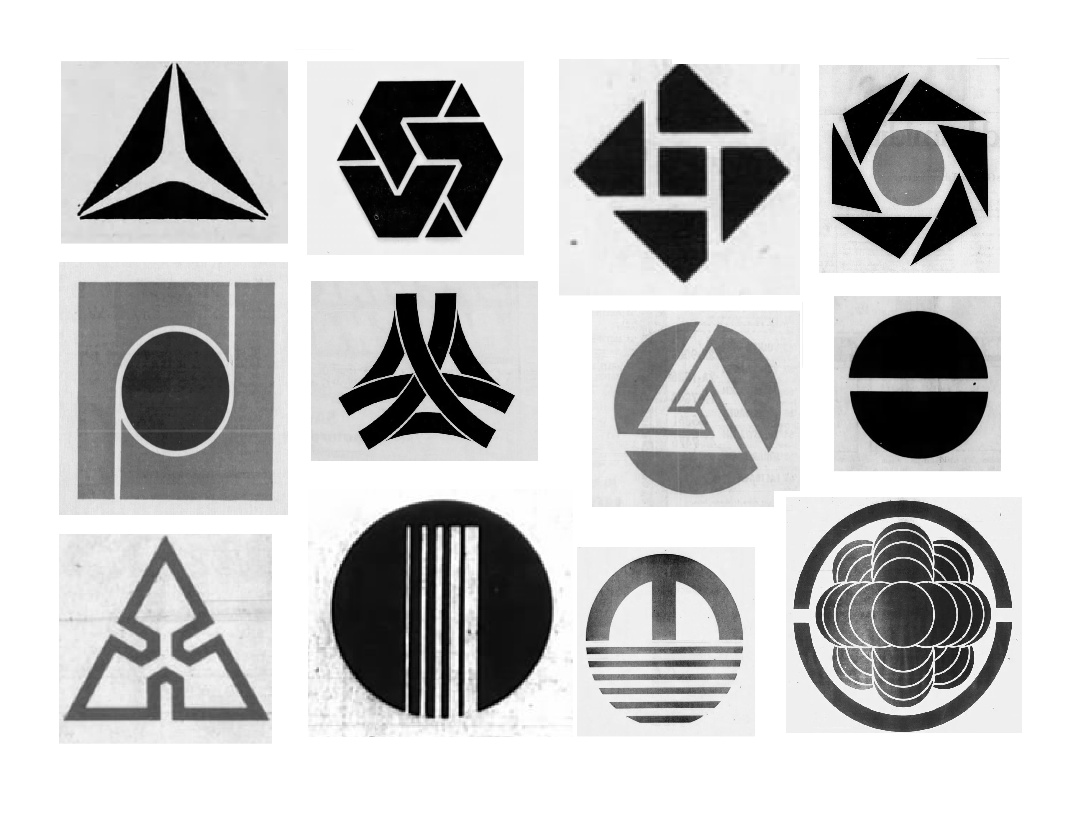
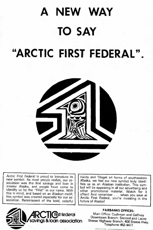
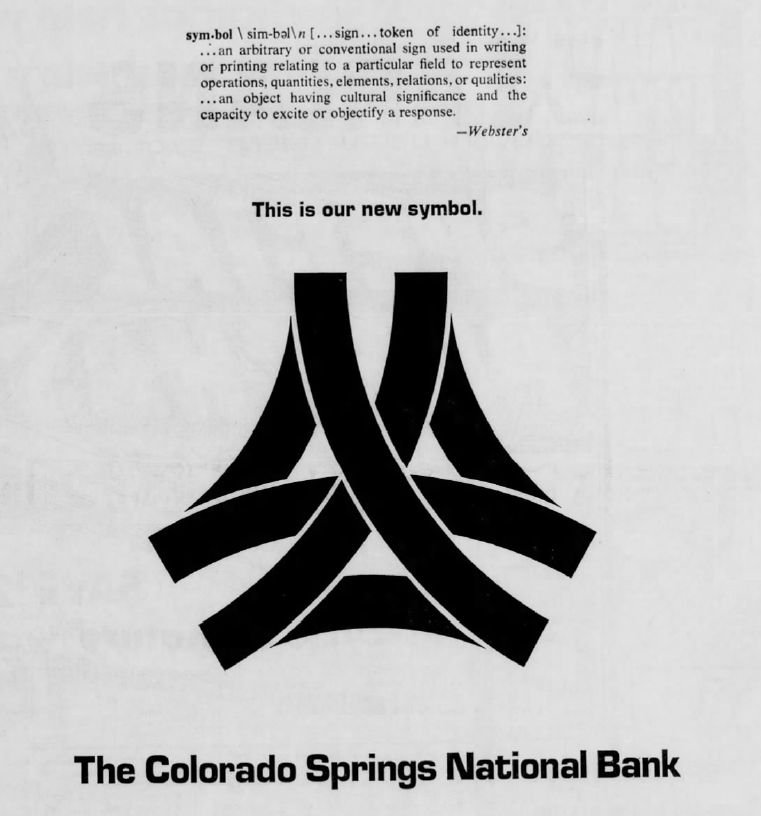
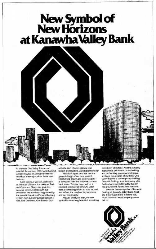
Emblemetric’s James I. Bowie has written an article for Marker about how US banks in the 1960s and 70s used newspaper ads to introduce their new abstract logos:
The Surprising Reason Why All Bank Logos Look the Same

Emblemetric’s James I. Bowie has written an article for Marker about how US banks in the 1960s and 70s used newspaper ads to introduce their new abstract logos:
The Surprising Reason Why All Bank Logos Look the Same
The annual celebration of Earth Day highlights an environmental consciousness that is becoming increasingly important as the threats associated with global warming rise. Yet American logo design has recently seen a resurgence of marks featuring smokestacks and factories which hearkens back to the earliest days of corporate symbolism in a rather environmentally unfriendly way. What’s behind this trend?
When companies first needed to express a visual identity to the public, the factory was a popular image to use. In his 1998 history of American business identity, Creating the Corporate Soul: The Rise of Public Relations and Corporate Imagery in American Big Business, Roland Marchand pointed out that “during the late nineteenth century and even later in some cases, as industries rapidly expanded, the factory image made good sense as a merchandising and public relations vehicle. Impressive and often romanticized, it assured customers that they were dealing with a stable, competent firm.” It had been noted that “these depictions [of factories] sought to hearten executives and impress viewers by displaying billows of (productive) black smoke spouting from a multitude of chimneys.” Marchand reported that “corporations selling products as varied as yeast, razor blades, fertilizer, and underwear all greeted the public with pictures of the factory.”
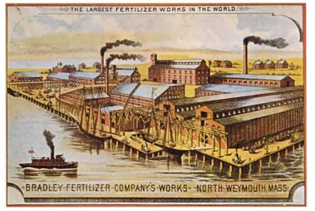
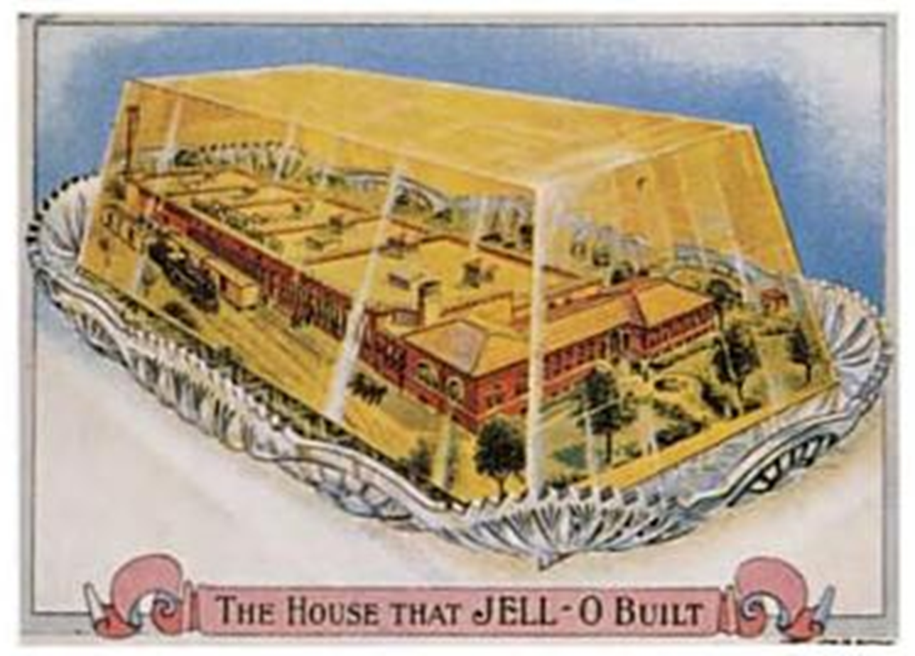
Late nineteenth-century trade cards depicting factories (Marchand, 1998)
The factory with smokestacks cliché in logo design persisted into the 1970s. Designer Jerry Herring’s 1975 pamphlet “Stock Trade Marks,” which satirized the lookalike logos of the time, asked the tongue-in-cheek question, “Dear corporation president, public relations director, or agency art buyer: Are you in need of a dynamic new image to replace the smoking smoke stacks you or your client is now using as a trade mark?”
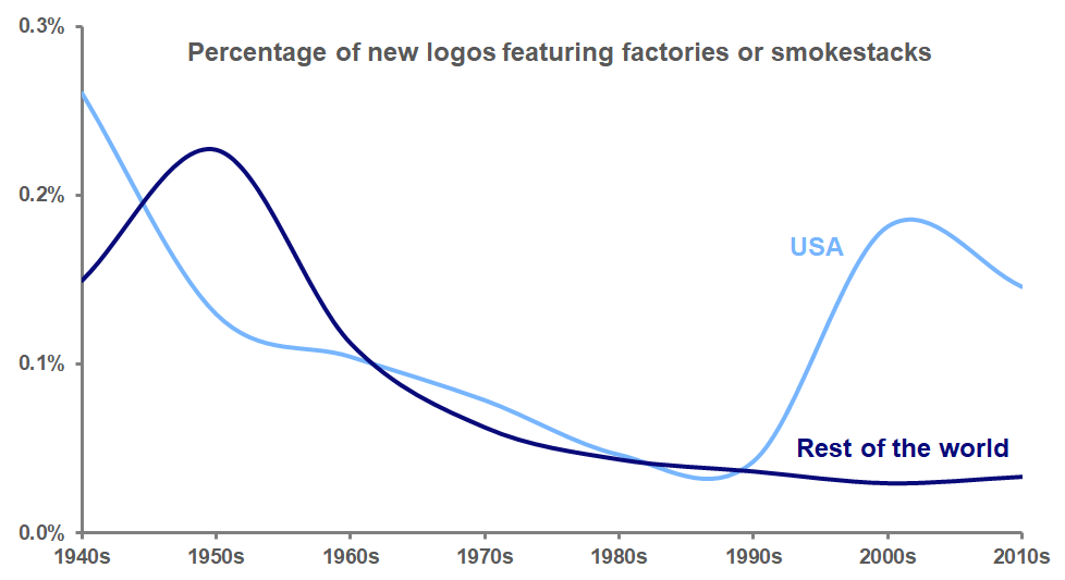
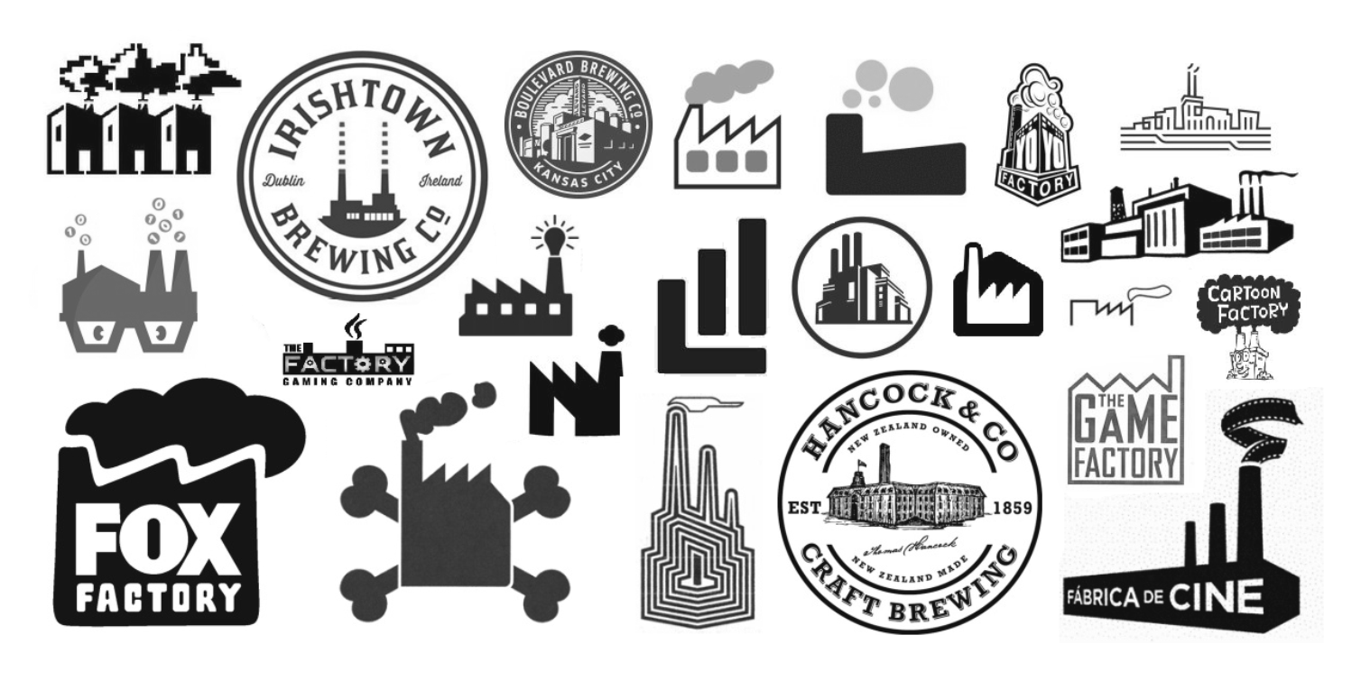
Analysis of data from the United States Patent and Trademark Office and the World Intellectual Property Organization, though, shows that by the seventies, the factory smokestack logo was on its way out, before reaching its nadir in the 1990s. But over the past two decades, these logos have rebounded to become more common again in the United States, although not in the rest of the world. American designers seem to revel in the graphic possibilities of the factory’s wafting smoke and distinctive sawtooth roof.
The popularity of these new smoky logos appears to be explainable in two ways. First, many of these marks use detailed, realistic depictions of factories to convey a sense of nostalgic authenticity, particularly for businesses with a hipster appeal, such as craft breweries. This attempt to invoke “old-timeyness” can also be seen in the use of logo design elements such as crossed objects, mustaches, and establishment dates.
Second, many of these new logos depict the factory in an abstract way, one that is figurative rather than literal. These logos often represent companies that don’t actually have factories; it’s just that the idea that their particular product (movies, games, cartoons) might be manufactured in a factory is whimsical and amusing.
But why would companies take the risk of offending the environmentally-sensitive public with these factory and smokestack images? As the Environmental Protection Agency data in the graph below shows, industrial emissions of carbon monoxide, a major greenhouse gas, have declined dramatically in the U.S. since 1970 as stricter environmental regulations have been put in place and industrial manufacturing has moved overseas.
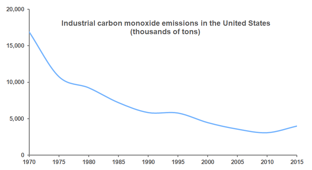
There are simply fewer smoky factories in the U.S. than there used to be. It may be that to many younger Americans, a factory spewing smoke is just not something that they ever encounter in their lives, and so the image of the factory functions more as a metaphor, a symbol of productivity or of historical sentimentality, rather than as a literal threat to their environment, making these logos acceptable in a way that they would not have been a few decades ago.
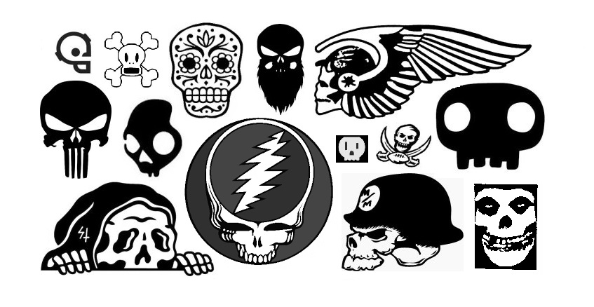
At Halloween, skulls and skeletons make for popular decorations, but in recent years they have been appearing with much greater frequency as design elements in American logos. Skulls, in particular, seem to have assumed a more prominent place in trademarks. Before the turn of the millennium, not many organizations, outside of the occasional rock band or biker gang, were interested in adopting a logo featuring a skull, traditionally the most common memento mori, or reminder of death. The skull’s long-held associations with piracy and poison did not help, either.
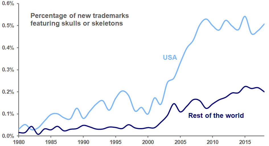
But analysis of United States Patent and Trademark Office data shows that between 2000 and 2009, the percentage of new logos with skulls and skeletons more than quintupled, and has remained at this higher level ever since.
What accounts for this increase? The trend toward skull logos has not been as noticeable outside of the United States. Analysis of World Intellectual Property Organization data from more than 100 other countries shows that the use of skulls and skeletons in logos also rose during the first decade of the millennium, but not nearly to the extent seen in the US.
It’s hard to ignore that the increase in American skull logos took place at the same time that the nation assumed a war footing after the terrorist attacks of September 11, 2001. As the number of combat deaths in Iraq and Afghanistan grew, so did the number of skull logos in the US. It does not seem unreasonable to speculate that, just as the use of logos featuring hearts increased after September 11, the specter of death raised by these wars permeated American culture and saw its expression in symbols of commerce. As these wars wound down, the use of skull logos leveled off, but has stayed high.
An examination of today’s American skull logos shows a variety of businesses exhibiting crude expressions of menace, juvenile assertions of badassedness, and more than a little fascist iconography. There are some exceptions to these trends, including the recent popularity of the calavera (the Mexican “sugar skull” used to celebrate Día de los Muertos) as a logo design element. But for the most part, these skull logos are more trick and less treat.
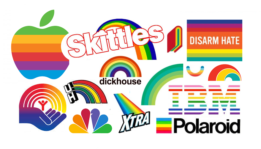
June is Pride Month, and the most visible manifestation of this celebration of the gay community is the rainbow–in particular, the Rainbow Flag designed by Gilbert Baker in 1978. In recent Junes, the flag has gone mainstream as companies such as IBM have rolled out rainbow versions of their logos to honor (or co-opt) the Pride movement.
The use of rainbows in commercial symbolism is a relatively recent phenomenon. Analysis of United States Patent and Trademark Office data (see below) shows that, prior to the late 1970’s, very few American logos featured rainbows. Saul Bass’s 1972 United Way logo was a notable exception, and Rob Janoff’s 1977 Apple mark, with its famously out-of-order colors, helped bolster the trend. In 1978, as Baker sewed his first flag and Robin Williams’s Mork from Ork first graced American airwaves with his rainbow suspenders, the popularity of rainbow logos suddenly spiked, and remained high throughout the 1980’s.
Early uses of rainbow colors in logos often specifically emphasized color as a product feature: NBC’s peacock highlighted the network’s color broadcasts, and Apple’s logo touted the Apple II computer’s color graphics capabilities. But the positivity and cheerfulness communicated by the rainbow make it an attractive choice as a general design element.
Of course, the rainbow’s appeal is based in color; designers’ early aversion to rainbows was likely due to the fact that logos often had to be presented in black-and-white media such as newspapers and fax. Throughout the 1980’s, this black-and-white world was still a reality, so rainbow logos had to be readable as rainbows even without color; hence, the familiar semicircular shape.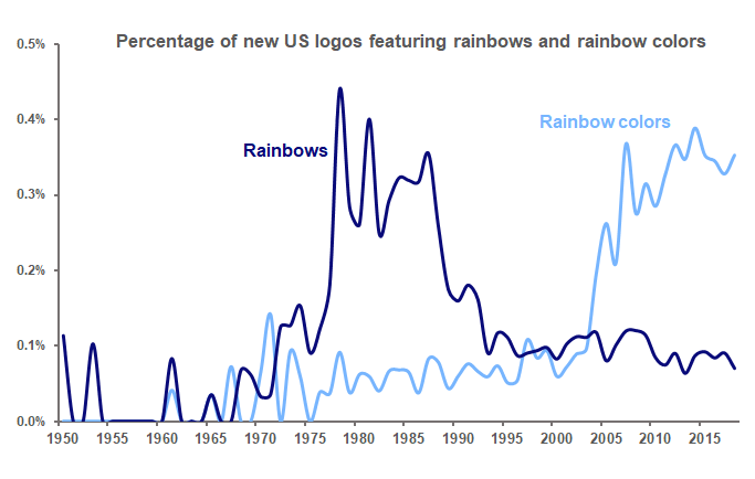
But in more recent years, as technological advances have brought color to almost every medium, the spirit of the rainbow can be communicated through its colors without the need for its explicit shape. Consequently, the use of rainbows as logo design elements has fallen back almost to its pre-1970’s level, while the use of rainbow colors in logos has taken off.
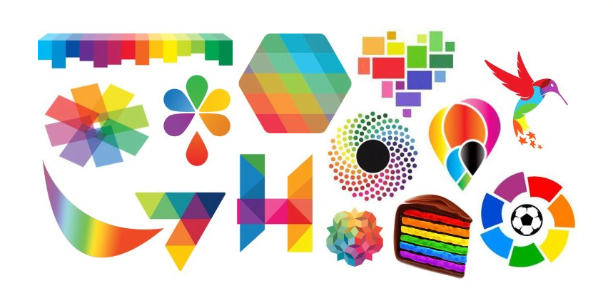
Today’s rainbow-colored logos reflect the joy and optimism inherent in the rainbow in a multitude of new expressions.
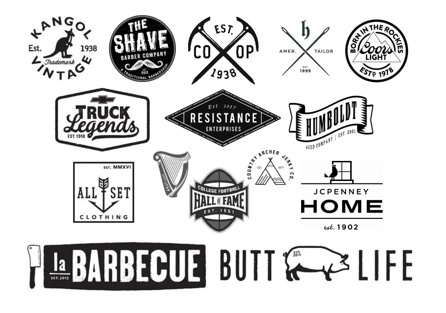
Does your local craft brewery’s logo helpfully inform you that the business was “Est. 2016”? Logos declaring the year that a company was established seem to be everywhere recently. In particular, businesses seeking to adopt a hipster aesthetic appear to append an “est.” to their logos just as often as they use crossed objects or mustaches in their marks. What accounts for the prevalence of this visual quirk?
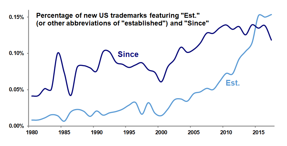
Analysis of United States Patent and Trademark Office data confirms that “est.” and other abbreviations for “established” have been appearing in trademarks much more often in recent years–in fact, in terms of percentages, 19 times more often this year than in 1980. The related term “since” has also enjoyed increased popularity among trademarks, but was no match for “est.,” which surpassed it in use in 2015.
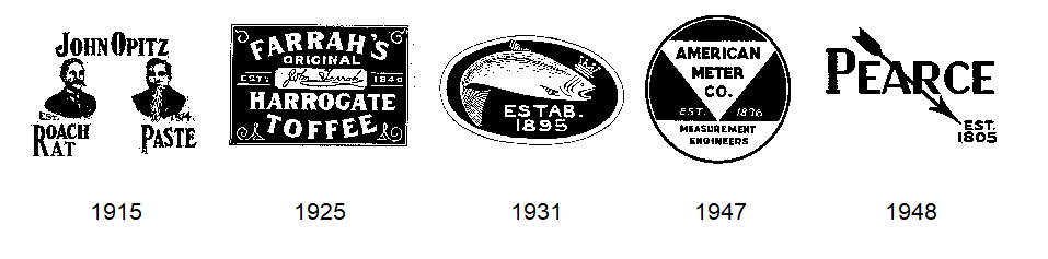
Among these “est.” trademarks filed this decade, the most common abbreviation used is “est.” itself (with or without the period), appearing in 91.7 percent of such marks. Less often used, accounting for 8 percent of these trademarks, is “estd.” and its variant “est’d.,” which, perhaps owing to their rarity, seem to project more gravitas, particularly in the typographic variation in which the “D” is made smaller and placed above the period (see the Guinness and Coors Light logos above). Only 0.3 percent of these marks dare to go with the “estab.” abbreviation.
“Est.” seems to function in trademarks in two ways. First, in a basic sense, it seeks to use the business’s longevity as a proxy for its trustworthiness and reliability. When a logo notes that a restaurant was “est. 2015,” though, this function disappears.
Among trademarks filed in 2017 to date, the average year that follows the “est.” is 1988, just 29 years ago. In comparison, the average year after the “est.” in trademarks filed in 2000 was 1939, or 61 years earlier. Clearly, the longevity-signalling function of “est.” is becoming less important today.
The second way that “est.” works in trademarks is to evoke the logos of the past. There is a sense that “est.” was used a lot in old trademarks; the marks below, all from the first half of the last century, exemplify this usage. Including “est.” in today’s logos is an attempt to imbue them with a vintage feel that often aligns with the aforementioned hipster look.
Digging back further into USPTO records, we can see that “est.” was indeed used much more often in the first half of the twentieth century than in the second half. Interestingly, though, the rate of use of “est.” during this decade has surpassed that of the 1910’s!
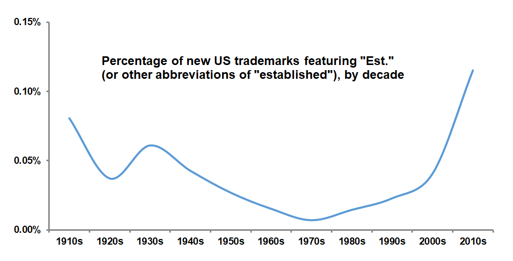 Today’s use of “est.” in trademarks is doubly ironic. Promoting a business as “est. 2017” in 2017 borders on ridiculousness. And using “est.” as a symbol of old-timeyness more often than it was used during those actual old times is nearly as silly. What is not clear, though, is how much of this irony is intentional.

When it comes to logos, it’s still a man’s world. Since 2000, male figures in US logos have outnumbered female figures by 3 to 1. A look back at logo design trends over the past 60 years shows that this is not a new state of affairs.

As the graph above shows, there has not been much change in the relative percentage of logos featuring males and females since 1950. Perhaps most notable here is the slight overall decline in male logos, which may be the result of the contemporary trend of designers using what Michael Bierut calls “neutered sprites” to represent people in general, when in the past they might have gone with more graphically elaborate male figures. (Gender-neutral figures such as Bierut’s sprites are not included in this analysis.)

We see above that this ratio of male to female logos has not changed much over the years; again, it appears that 3 out of 4 new logos that have some gendered element are male as opposed to female, with a slight decline in that ratio over time that may be attributable to the “sprite effect” discussed above.
 Across all years, 76 percent of gendered logos feature male design elements, while 24 percent contain females. There is variation from these averages across industries, however. Logos from industrial categories such as firearms, construction, and telecommunications are more likely to include male figures, while among logos related to clothing, pharmaceuticals, and alcohol, there is a more pronounced tendency toward featuring females.
Will the gender gap in logos ever be closed? There certainly do not seem to be a lot more women appearing in logos. Designers seeking to avoid giving off an impression of sexism seem more likely to use a genderless figure, rather than a female one, to represent a generic person. If women are to catch up to men in logos, it will probably be due to more male figures being replaced by “neutered sprites,” not to any increase in the use of female design elements.