Heart Rate Rising

heartlogos

James I. Bowie

With Valentine’s Day upon us, hearts are everywhere, and they seem especially prevalent these days in logos and other visual symbols. Art historian Martin Kemp, in his 2012 book Christ to Coke: How Image Becomes Icon, outlines the fascinating and complex use of the “heart-shape” over history, from early anatomical depictions of the organ to the symmetrical symbol that we are familiar with today. “It is,” Kemp writes, “a shape that is appealing in its simple yet seductive rhythm, and once seen it is difficult to forget. It is like the melody of a great pop song.”

This appeal of the shape, along with its positive connotations of love and life, have long made it a popular design element. Oscar-Edmond Ris-Paquot’s 1893 Dictionnaire Encyclopédique des Marques & Monogrammes is full of heart marks used over the previous several centuries.

rispaquot hearts 1065

By the early twentieth century, there were warnings that hearts made for poor trademarks and logos due to overuse and subsequent lack of distinctiveness. Glen Buck, in his 1916 book Trademark Power: An Expedition Into An Unprobed and Inviting Wilderness, wrote “Common and familiar forms do not usually make good trademarks, for they lack distinction. The circle, the square, the crescent, the star, the diamond, the heart, the oval, the shield, the cross, all have long ago been usurped and are burdened with significance.” And yet the register of the United States Patent and Trademark Office continued to fill up with heart trademarks.

old hearts

The use of hearts in logos was further boosted in 1977 with the introduction of Milton Glaser’s massively popular “I ♥ NY” mark, which quickly inspired a host of imitators. As of this writing, United States Patent and Trademark Office records show that there are 1,407 “I ♥” trademarks registered.

i heart logos

In recent years, designers have realized the potential of the simple heart shape to be used in increasingly clever and elaborate ways. One such application is to turn the heart into a letter of the alphabet for use within a wordmark. The versatile heart shape may take the form of, at a minimum, the letters a, b, c m, o, u, v, and y. A 2013 Emblemetric analysis showed that hearts are especially popular elements of “frankenmarks” (wordmarks featuring a pictorial element replacing a letter), appearing in 3.54 percent of such logos.

heart frankenmarks 1065

The popularity of the heart, though, often means that appealing visual uses of the shape have been done before. Designers seeking to create a logo that employs two fingerprints to make a heart, or two hands to form a heart, or a handshake as a heart, or a heart within a pawprint should perhaps reconsider.

heartcliches 1065

The ubiquity of hearts has continued in recent years, as companies such as Southwest Airlines, CVS Health, Airbnb, and Thomas Cook have unveiled new heart logos. Hearts play an important role in indicating positivity on social media sites such as Instagram and Periscope. Late last year, Twitter famously changed its starred “favorites” to heart-denoted “likes,” and detached the symbol from its traditional meanings, declaring that it could represent anything from “wow” to “high five” to “stay strong.” Hearts are consistently among the most commonly-used emoji, and can even be expressed in plain text form as “<3”.

Analysis of United States Patent and Trademark Office data reveals the increasing use of hearts in logos over time. Heart logos as a percentage of all US logos peaked in 1989 at 1.74 percent, then declined to 0.95 percent in 2000. Starting in 2001, heart marks took off again, reaching 2.25 percent of all logos in 2013.

heartgraph 920

The sharp increase between 2001 and 2013 may be attributable to any number of causes that lie beyond our understanding. But it is worth considering the possible impact of the September 11, 2001 terrorist attacks on the American psyche and, subsequently, American logo design.

heartgraph2 920

Zooming in to examine the data by month, we can see that the period following September 2001 brought several spikes in heart logos as the trend began to move upward. Of course, the timing of the filing of trademarks for businesses and products is dependent upon many factors. I don’t find it unreasonable, however, to speculate that in the wake of September 11, Americans’ yearning for love and healing was ultimately manifested in the heart-shaped logos that surround us today.

The Confederate Flag, Going Out of Business

confederateflaglogos

James I. Bowie

The horrific June massacre of nine African-American churchgoers in Charleston, South Carolina by a gunman with a fondness for the Confederate battle flag galvanized public opinion against the symbol, resulting in its removal from the state’s capitol grounds after years of controversy. The perception of the flag as symbolic of racist hate seemed to gain traction against the competing view of it as a benign emblem of Southern heritage.

From a commercial standpoint, this was a debate that appears to have long since ended. The Confederate flag’s use as a logo design element by US companies has dwindled to a low level, according to an analysis of United States Patent and Trademark Office records. Currently, there appear to be just eighteen active, or “live,” US trademarks that feature Confederate flag imagery (by contrast, there are 1,938 active marks featuring the US flag). Tracking these flag logos over time is difficult, because USPTO records do not include marks that “died” prior to the 1980’s. But of the 83 marks that can be identified in the USPTO database, most were owned by companies in the South, as shown on the map below, and 78 percent are no longer active, or dead.

confedmap

Of course, not all businesses officially register their marks with the USPTO, so there are other Confederate flag logos in use, including one that an Iowa bagged-ice company has said it will not abandon. But use of the flag in larger, mainstream contexts appears to have vanished.

Older USPTO records show the flag in logos for products like shrimp (“Taste of Dixie,” 1991), mops (“Dixie Dust Control,” 1981), boats (“Dixieland Marine,” 1981), and blue jeans (“Rebel,” 1984). But these marks are no longer active, just as, over the years, the Six Flags amusement park lowered the battle flag, the NASCAR Southern 500 race dropped it from its logo, and the country band Alabama stopped using the flag, which had adorned four of its album covers.

mainstreamconfederatelogos

Today, use of the Confederate flag in logos is confined to a narrow group of business types. Of the 49 Confederate flag marks filed since 2000, over half (55%) represent clothing lines, such as the purveyors of lifestyle or novelty t-shirts seen below.

confederateclothinglogos

Interestingly, some of these marks have attempted to co-opt the flag as a symbol of African-American identity, in the manner of Kanye West.

blackconfederatelogos

Eighteen percent present the flag in an historical context, often in conjunction with the US flag.

civilwarconfederatelogos

Sixteen percent are associated with motorcycle clubs, where the “rebel” aspect of the flag’s meaning is still appreciated.

confederatemotorcyclelogos

The meaning of symbols, including words and logos, can change over time. If public opinion continues to turn against the Confederate flag, it is not inconceivable that logos featuring it might someday be denied trademark protection, in much the same way that National Football League’s Washington team has seen its “Redskins” trademark canceled.

Not Bucking a Trend

1 - oldnewbucks

James I. Bowie

On Monday, the Milwaukee Bucks of the National Basketball Association unveiled a new logo. Like the team’s old emblem, it is a depiction of a fierce stag, but the new mark contains an image of a basketball, cleverly hidden in the negative space of the antlers. By switching from a logo without a basketball to a mark with one, the Bucks have joined 21 other NBA teams with basketballs in their primary logos. Seventy-three percent of NBA teams’ symbols now include basketballs.

2 - nba logos with balls 1065

By contrast, only 13 Major League Baseball teams, or 43 percent of the total, have baseballs or other imagery inherent to the sport in their logos.

3 - baseball logos with balls 1065

And just four National Football League team logos, or 13 percent, feature footballs or football-related imagery.

4 - football logos with balls 920

5 - graph 1 668

Why the discrepancy between the leagues? One might speculate that spherical basketballs and baseballs make for more visually pleasing design elements than oblong footballs. Analysis of data from the United States Patent and Trademark Office shows that while all sorts of sports balls have become more common in American logo design over the years, round basketballs, soccer balls, baseballs, and even golf balls are more common than footballs in logos.

6 - ballsgraph 1065But there may be more going on here. It is useful to consider Rutgers University sociologist Karen A. Cerulo’s 1995 book, Identity Designs: The Sights and Sounds of a Nation, which included a quantitative analysis of national flag designs. Cerulo found that the flags of powerful “core” nations (such as those of Russia, Italy, and Germany, below left) tend to have simpler designs, while the flags of less-powerful, lesser-known “peripheral” countries (like those of Mongolia, Fiji, and the Marshall Islands, below right) are often more elaborate and embellished in their designs. There are exceptions, of course. The U.S. flag’s design is one of the world’s most elaborate, but when it was created, the country was still unquestionably “peripheral.”

7 - flags 920

Core nations are so widely recognized that their flags need not say much specific about them, in the same way that well-known companies like Nike and Starbucks are able to drop their names from their logos and be known simply by their symbols. Peripheral nations, however, must use their flags to communicate detailed information about themselves to a world audience that is likely unfamiliar with them.

Consider the flag of Nicaragua. While its basic design of three horizontal bands is similar to the flags of many core nations, the national coat of arms in the center includes text spelling out the country’s name and geographic location, as well as depictions of symbolic elements like a rainbow, five volcanoes, an ocean, and a Phrygian cap. The busyness of the design screams “peripheral nation.”

8 - nicaragua 668

The NBA was once very much a “peripheral” U.S. sports league, far less popular than the country’s “national pastime,” baseball. Indeed, in designing its new logo in 1970, the NBA, in an attempt to boost its legitimacy, was reduced to mimicking Major League Baseball’s one-year-old silhouetted batter logo. Unlike baseball, though, the NBA felt the need to include its initials in its logo, in much the same way that Nicaragua needed to write its name on its flag.

mlbnba 668

Today, football is the most popular sport in the U.S., and few NFL teams are inclined to include footballs in their logos. They don’t need to, because the public knows that they are football teams; there’s no reason to spell it out. As a consequence, NFL logos are among the most striking and visually powerful in sports. They don’t get bogged down in communicating something like, “Hey, we’re a football team,” just like Germany’s flag doesn’t need to use symbolism to say, “Hey, we’re a country in Europe, we make nice cars, maybe you’ve heard of us?”

It wasn’t always this way though: a look back in NFL history shows that before football was king, many NFL teams featured football-related imagery in their marks.

10 - old nfl logos 1065

Major League Baseball, knocked from its perch by football, features more team logos with design elements related to its sport than does the NFL. The NBA, though, is absolutely overrun with basketballed logos. Some, such as those of the Los Angeles Lakers, Los Angeles Clippers, New York Knicks, and Detroit Pistons, are little more than generic depictions of basketballs. It is as if a refrigerator manufacturer decided to use a picture of a fridge as its logo; it’s hard to imagine a less evocative, less distinctive, or more boring visual symbol.

The irony is that the NBA is no longer peripheral; it has become quite popular not just in the United States, but worldwide. There’s no need any more for it to use the design strategy of a second-rate organization. When it comes to logo design, the NBA should drop the ball and seek to build stronger visual identities for its teams.

What Next, North Dakota?

sioux images

James I. Bowie

American colleges and universities have now largely abandoned Native American nicknames and logos that many find offensive. In 2012, following a battle that had lasted years, the University of North Dakota was forced to drop its “Fighting Sioux” nickname, which had been used by its athletic teams since 1930. Since then, the North Dakota teams have played without a nickname, something virtually unheard of in American sports. This year, having completed a two-year “cooling-off period,” the university will begin the process of selecting a new nickname. The old name, however, does not look like it will be forgotten quickly.

On a frigid Friday night in Grand Forks, North Dakota last November, I joined the throngs of UND hockey fans as they filed into the palatial Ralph Engelstad Arena to watch their team, a perennial college hockey powerhouse ranked number two in the nation, take on the seventh-ranked Miami University RedHawks from Oxford, Ohio, where I grew up.

“Let’s go, Sioux!” shouted one fan disembarking from a shuttle bus. “Who said that?” asked another, in mock indignation over the utterance of the banned name. “Everyone,” deadpanned a third.

And indeed, minutes later, when the public address announcer marked the arrival of the home team to the ice with, “Here comes the University of North Dakota…,” seemingly all 11,537 in attendance filled in the blank by bellowing “SIOUX!”

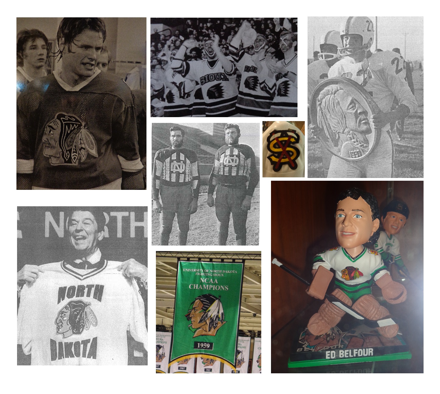
“The Ralph,” as the arena is known, is itself a monument to the Fighting Sioux nickname and logo. Engelstad, a former UND hockey player who made a fortune in the Las Vegas casino business, poured over $100 million into building the arena. During its construction in the late 1990’s, the controversy over the nickname flared up, and Engelstad threatened to withdraw his financial support if the nickname was changed.

As a safeguard against that possibility, Engelstad, before his death in 2002, had the Sioux logo emblazoned everywhere he could in the arena, making its removal cost-prohibitive. The “Quick Facts” section of the arena’s website goes so far as to point out that The Ralph contains “2,200 logos.” (My father, who taught Russian at Miami, told me that this reminded him of the story of Russia’s “Mad Czar,” Paul I, son of Catherine the Great, who, in a fit of insecurity, plastered his monogram all over his new castle, only to be assassinated forty days after he moved in.)

2 - sioux logos
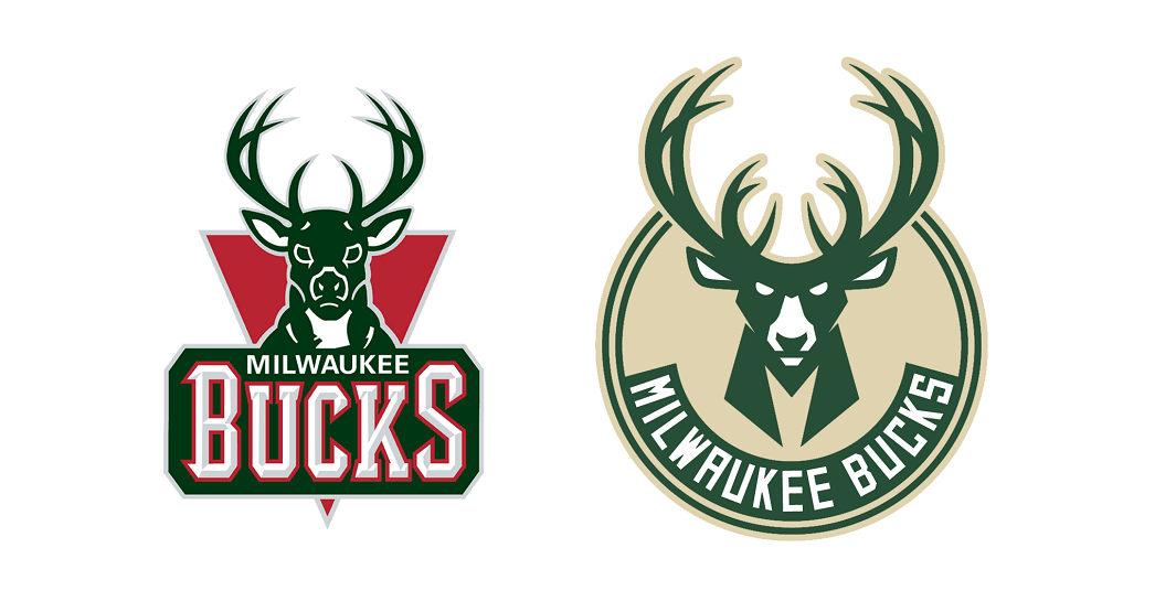
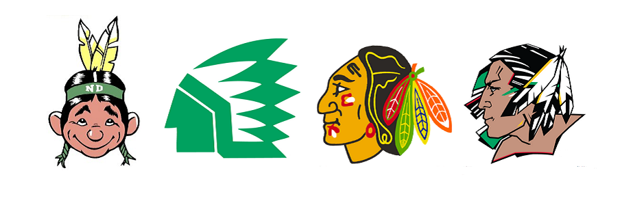
The logo, a depiction of a stoic Native American in profile, had itself been commissioned by Engelstad in 1999 to replace previous marks that UND had used, including a 1960’s Indian caricature, a 1976 abstract chief logo, and a version of the Chicago Blackhawks’ gently smiling Indian with multicolored feathers, borrowed with the permission of the National Hockey League team.

3 - engelstad sioux logos

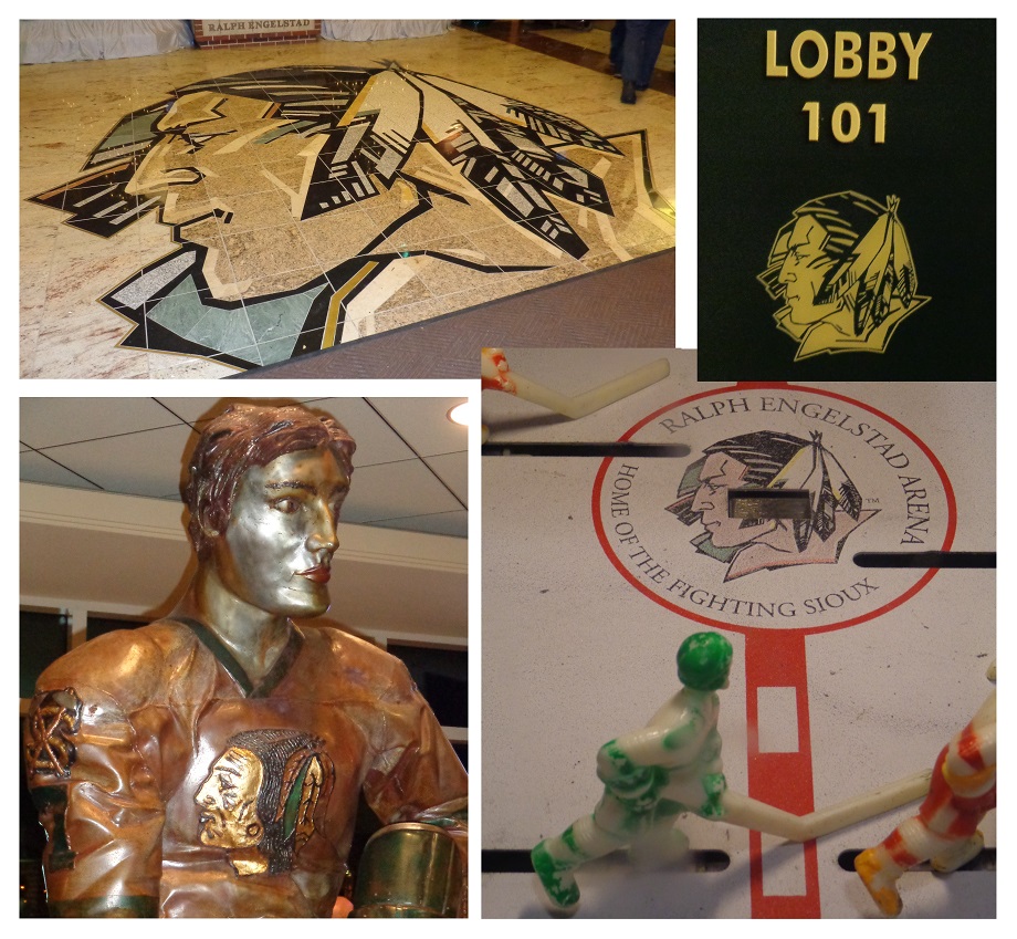
Before the game, I strolled around the arena. Sioux logos were, indeed, everywhere, from the granite floor to statues, from room number signs to the “center ice” of a bubble hockey game. Engelstad’s plan had worked; there were just too many logos to get rid of them all, and a 2012 agreement between the National Collegiate Athletics Association, which had forced the nickname ban, and the North Dakota Attorney General reversed a previous edict and allowed the logos to stay.

The nickname, too, was readily found in the arena, even though it could not officially pass anyone’s lips. Christmas shoppers crowded the “Sioux Shop,” a name that I suppose was an improvement over the “Sioux-venirs” moniker that the university had used in the past. Their purchases were in evidence around the arena, as the great majority of fans were decked out in team merchandise, much of it of the “Fighting Sioux” variety.

The atmosphere in the packed arena was electric, and the game was exciting, with the visitors pulling out a 3-2 victory. Miami, too, had been through a nickname change, as in 1997 the teams that I grew up rooting for as the Redskins became the RedHawks, complete with the characteristic nineties mid-word capitalization. That change had met far less resistance than what was being expressed at UND.

The Sioux nickname appeared to be heavily ingrained in the local culture, and it seemed that the outside pressure that had led to its removal only made UND fans more eager to hold onto it. In my hotel room that night, I noticed that the walls were not adorned with the generic artwork typical of such accommodations, but with historical photographs of UND hockey fans in Fighting Sioux gear.

The next day, I avoided the Grand Forks cold, walking from my hotel down a hallway to the adjacent Alerus Center, a convention facility that also serves as home to the UND football team. There I watched the Lumberjacks of Northern Arizona University, where I teach, face North Dakota on the gridiron. While the hockey game had matched two national powers, the football game was a meeting of teams from the relative small-time of the NCAA Division I Football Championship Subdivision, and there was far less excitement in the air.

The Alerus Center, while pleasant enough, had a sterile, sparse feel. It was a city-owned facility off of the UND campus, and there were certainly no Sioux logos to be seen; only an interlocking “ND” monogram served to represent the team. The UND supporters, as they had been at the hockey game, were eager to extend pleasantries to me as a fan of the visiting team, taking “Minnesota Nice” to the next level. The announced crowd of 5,916, which felt and sounded smaller than that, was treated to a hard-fought contest which the North Dakotans won with a last-second field goal, dashing NAU’s hopes for a Big Sky Conference championship.

Ironically, NAU football coach Jerome Souers, the only Native American head coach in Division I college football, is of Sioux descent, although he rejects the name as a French label imposed on his people and prefers to identify himself as Lakota. At an NAU forum about the Native American nickname controversy the week after the North Dakota game, he spoke eloquently about his opposition to the use of Native Americans as mascots. Hearing him served as confirmation to me that the UND name change was necessary, and that holdouts such as the Florida State University Seminoles, Washington Redskins, and Cleveland Indians would need to change as well.

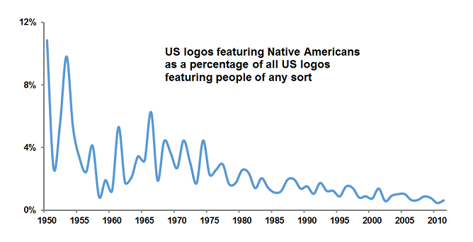
This conclusion seems in line with my analysis of data from the United States Patent and Trademark Office, which shows that the use of depictions of Native Americans in U.S. logos in general has been declining for decades.

4 - native american logos graph

What, then, will be next for North Dakota? The university has established a “Nickname and Logo Process Recommendation Task Force” which may in turn appoint yet another committee to help select a new name this year.

In my opinion, universities have not often done a good job of replacing Native American nicknames and logos. Fearful of controversy and hamstrung by committee decision-making processes, they have often selected names and marks that are bland, generic, uninspiring, and lacking in distinctiveness.

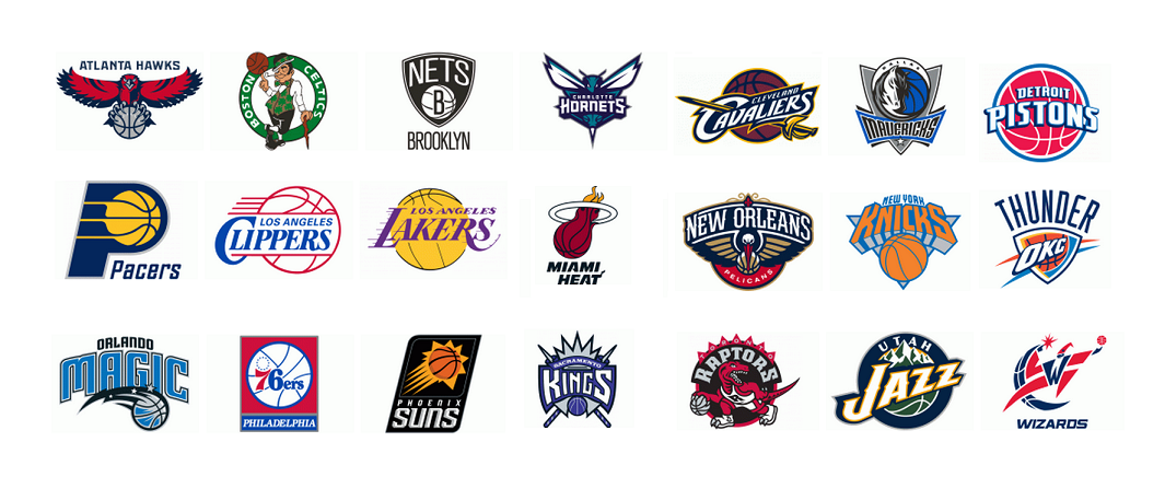
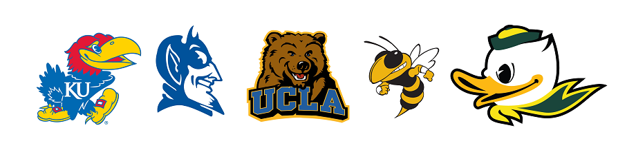
Birds are a typical choice. Of Division I schools that dropped Native American nicknames, 39 percent subsequently adopted a bird mascot. By comparison, among other Division I schools, only 15 percent have bird mascots.

Colors are also popular in post-Native American nicknames. Fully half feature some reference to color, compared with just seven percent of other schools’ nicknames.

Sometimes, birds and colors are combined, as in the case of the Miami RedHawks, Seattle Redhawks, Southeast Missouri State Redhawks, and Marquette Golden Eagles. UND would do well to avoid these clichés by selecting a name that is distinctive and memorable.

Logos can be very important to universities, and not just for their symbolic value; just ask the University of Texas, which makes over $10 million a year by licensing its Longhorn mark. In designing a new logo, North Dakota would be wise to avoid a visual trend that has been plaguing college sports in recent years: the “mean mascot” logo. While mascots have long been depicted in aggressive postures that imply competitiveness, college mascot logos of late have adopted a succession of dour grimaces and pained expressions that seem to suggest that athletic competition could never involve an ounce of fun.

5 - mean mascot logos

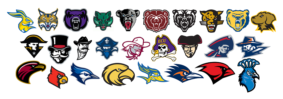
And this parade of gruff forest creatures, pissed-off men in hats, and angry birds doesn’t just connote joylessness, but may also signify insignificance: while 54 percent of schools in the NCAA’s “Power 5” Conferences, the true “big-time” of college sports, have “mean mascot” logos, fully 73 percent of the other Division I universities, the more “small-time” schools, do. And 19 percent of the Power 5 have smiling “happy mascot” logos, compared to just 5 percent of the smaller schools. In some sense, a mean mascot may be a sign of being small-time; the more prominent college athletic programs are more likely to have the confidence to go with a less “intimidating,” more relatable, happy mascot.

smiling mascot logos

I submit that if UND wishes to be perceived as a powerful sports program, it should avoid a logo with a cranky mascot and instead opt for one that suggests confidence, positivity, and fun.

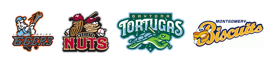
The most fertile ground for creative, fun sports nicknames and logos currently exists around minor league baseball teams. These organizations, compared to universities, are relatively unencumbered by tradition and the need for solemnity. They seem to pick names and logos that will draw fans and sell t-shirts through attractive design and good humor.

7 - minor league logos

The University of North Dakota faces a tough challenge in that so many of its fans seem unwilling to let go of the “Fighting Sioux” name. In addition, picking an official nickname by means of a committee presents issues of its own, as creative endeavors are not easily accomplished through bureaucratic processes. Even the term “official nickname” is an oxymoron; nicknames are inherently informal, and arose in the past in more organic ways.

I don’t think that there is an easy solution to UND’s quandary, but I would like to suggest one possibility: returning to the nickname that was replaced by “Fighting Sioux” in 1930, the Flickertails. A flickertail is a squirrel native to North Dakota and was seen by many at the university at the time as not tough enough to serve as a mascot. The same criticisms would probably be leveled today, but I would argue that insistence on a hyper-aggressive mascot is indicative of insecurity about being “small-time.” It’s worth considering that the college football national championship was just contested by the “Ducks” and the “Buckeyes.”

Flickertails would not only be a unique, memorable nickname, and would lend itself to a creative and fun logo treatment featuring a happy mascot, but it also has a basis in university history and tradition that would grant it a certain legitimacy. So, what do you say, North Dakota?

The Growth of the Mustachioed Logo

Mustache logos

James I. Bowie

As November dawns, the world’s attention turns to mustaches. In recent years, movements such as Movember and No-Shave November have turned this month into an opportunity for men to raise money for charities concerned with men’s health issues by growing facial hair. The popularity of these events can certainly be tied to the larger trend of men increasingly sporting beards and mustaches (or, to use the hipper British spelling, moustaches).

1976 study in the American Journal of Sociology found that, although both beards and mustaches had enjoyed periods of high levels of popularity among Englishmen over the previous century and a half, both had fallen out of fashion by the 1970’s, as illustrated in the graph below.

facial hair graph

By the late twentieth century, facial hair had taken on negative connotations, becoming associated with villainy, stodginess, and deviance. An early-seventies researcher for CBS Television went so far as to say that “there were four leprous castes that viewers would never accept as lead characters: divorced people, Jews, New Yorkers, and men with mustaches.” That line of thinking was soon to be obliterated by shows such as Magnum, P.I. Contemporary observation, as well as recent market research, shows that facial hair, whether worn earnestly or ironically, is making a comeback, particularly among younger men.

Culturally, facial hair, and the mustache in particular, has taken on a new symbolic presence, one that is reflected in the logos of United States businesses and products. Analysis of data from the U.S. Patent and Trademark Office shows that the percentage of new American logos featuring facial hair of some sort as a design element has shot up over the past decade.

facial hair logo graph

Looking back through older U.S. trademarks, it becomes apparent that the way facial hair is used in logos has changed as well. A famous early mark that incorporated facial hair was that of Smith Brothers Cough Drops, featuring portraits of the bearded “Trade” and “Mark” Smith, which was first used in the 1870’s. A 1931 article in the trade publication Printer’s Ink called it “one of the most utterly distinctive trade-marks in existence…This is partly due, no doubt, to the almost diabolical skill of the artist who made the original drawing of the bewhiskered visages of Trade and Mark Smith.”

While not very impressive by modern standards, the Smith Brothers mark’s appeal is probably similar to that of Duck Dynasty today: many people seem enamored by families with abundant beards.

The used of bearded and mustachioed trade characters in logos continues to this day. Because facial hair is an particularly distinctive personal characteristic, especially during times when relatively few men have it, it makes for an effective design element.

mustache charachters

As logos in general began to become less realistic and more abstract, the mustache took on the role as stand-in for a man’s face. When used in conjunction with a hat, a mustache could often represent a man in an abstract way that was consistent with contemporary trends.

mustache face logos

A related use for mustaches in American logos has been as a somewhat unfortunate and lazy way to communicate Italian or Mexican identity, particularly among marks for restaurants. In these more culturally sensitive times, this trope would seem to be on its way out.

Mexican Italian mustache logos

In recent years, the mustache has escaped the confines of the male face to emerge as a stand-alone design element in logos. The “olde-timey” stylized mustache shape, as exemplified by the pink, furry mustaches on the front of Lyft cars, the hipster finger mustache tattoo, and the Lexington Legends minor-league ballcap, has become almost ubiquitous, and, dare I say, iconic.

Iconic Mustaches

The beard, on the other hand, while becoming much more prevalent on male faces and in popular culture, has not yet had a big impact in the world of logo design. As a design element, the beard cannot match the mustache’s ability to stand on its own.

Beard logos

Without connection to a face, the beard seems adrift in space, floating disembodiedly. Perhaps some intrepid designer may be able to solve this problem; the next fortune to be made in graphic design might lie in the harnessing of the symbolic potential of the beard.

The SEC Succeeds with an Antimodern Logo

SEC

James I. Bowie

The Southeastern Conference, or SEC, has dominated America’s most popular college sport, football, in recent years, winning seven of the last eight national championships. It features fourteen members from across the football-mad South, including such traditional college football powerhouses as the Alabama Crimson Tide and the Georgia Bulldogs. On Thursday of this week, the SEC will parlay its on-field success into a lucrative television venture as the SEC Network, a cable channel operated under the aegis of ESPN, debuts.

While the popularity of the SEC may be attributed primarily to its victories on the gridiron, the conference has also benefited from branding efforts that have resulted in a strong visual identity. Specifically, in 2007 the SEC began using, as part of a celebration of its 75th anniversary, a new logo featuring the conference initials confined within a circle. But in fact the logo was not exactly new; it was a variation of a mark used by the conference for years, a “pinwheel” with banners for each of the conference members emanating from the central circular monogram.

Old SEC pinwheel logo

The old SEC “pinwheel” logo

This pinwheel logo dated to a time when branding efforts by college athletic conferences were not afforded much concern. Indeed, the SEC circle mark was generic, derived from a common monogramming technique that produced many company logos (see above), and is still in use today for monogrammed personal items.

In 1988, the SEC attempted to adopt a contemporary image, implementing a new logo with its initials in a somewhat futuristic typeface over a diamond-shaped background of stripes.

Old SEC logo

The SEC’s “Diamond” logo, in use 1988-2007

This “diamond” logo was used until 2007. Its replacement represented a realization by the SEC that its image and appeal were based not in the present, but in the past. Although college sports, and football in particular, have become multimillion dollar businesses, what differentiates them from professional sports is a stronger sense of passion and loyalty among their fans, and a great concern with the long-held traditions surrounding the teams and the universities they represent.

Analysis of logo design data from the United States Patent and Trademark Office clearly shows that the SEC logo is most closely associated with the period before 1960. US logos featuring a circle containing letters have fallen out of fashion since that time; in the most recent decade, they made up less than .01 percent of new marks.

SEC graph

The genius of SEC branding is that it wholeheartedly embraces a logo with such an antiquated style. Doing so allows the conference to project an image steeped in tradition, heritage, and authenticity, one that resonates with its fans, particularly in the South, where nostalgia for an idealized past remains strong. As the song says, “old times there are not forgotten.”

The logo might best be characterized as “antimodern,” rejecting as it does contemporary design trends in favor of datedness. The SEC is not the first organization to adopt such an antimodern logo: the All England Lawn Tennis Club’s Wimbledon Championships and NASA both abandoned modern-looking logos in favor of more dated-looking marks after concluding (rather bizarrely, in NASA’s case) that their images were better linked to the past than to the modern day.

wimbledon old logo

Modern Wimbledon and NASA logos and their antimodern replacements.

The SEC logo has achieved distinctiveness in a roundabout fashion. At the time of its first use, the SEC pinwheel monogram would have appeared quite mundane, bearing a strong similarity to many other marks of its day. Today, however, the great majority of those similar monogram logos have died off, as shown in the graph below.

SEC graph 2

As a result, the resurrected SEC monogram is left with a quite distinct appearance, particularly in relation to its fellow collegiate athletic conferences, many of whose logos have in recent years taken on a similar hyper-italicized, pointy-serifed, futuristic look.

spiky conference logos

Contemporary college athletic conference logos

In fact, today the SEC logo bears less resemblance to the symbols of fellow American college sports conferences and more to the crests of many Brazilian soccer teams. These clubs likely adopted their emblems when the circular monogram style was in vogue and retained them ever since, avoiding the need for the type of antimodern about-face done by the SEC.

Brazilian Soccer Crests

Brazilian soccer team crests

________________________________

Interested in reading more about college sports logos? Here is a history of the Texas Longhorn logo from Emblemetric’s James I. Bowie:

Longhorn Logo Turns 50